—Cultura Inquieta
“Cultura Inquieta” is a website and online platform dedicated to promoting and spreading culture in its various forms, such as art, music, literature, photography, and cinema.
Extremely popular, especially on its social media channels, it is known for portraying contemporary culture in a close, immediate, and effective format. Even though their online platform is their core, Cultura Inquieta is much more than that. It is also a communication agency and events, and is also present in the offline world through its annual festival held in Madrid, which features a lineup of concerts, art exhibitions, films, talks, debates, workshops, and activities for children.
This year, after a career that can be defined as “long” for the usually brief, instant digital world, they got in touch with Paseo to update their brand and graphic system. A universe of brands connected by the same idea, the same personality, and the same purpose: to generate and maintain a great creative community.

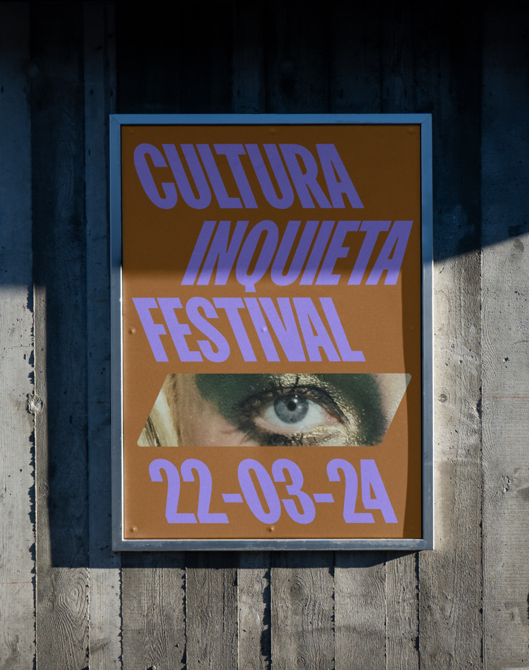
With a new plan of action for the future of Cultura Inquieta defined by Estudio Brillante, the new brand looks at this future and prepares for it, looking forward. A slanted text-based identity pointing to the bright, diverse and future ahead of us. Always on the move.

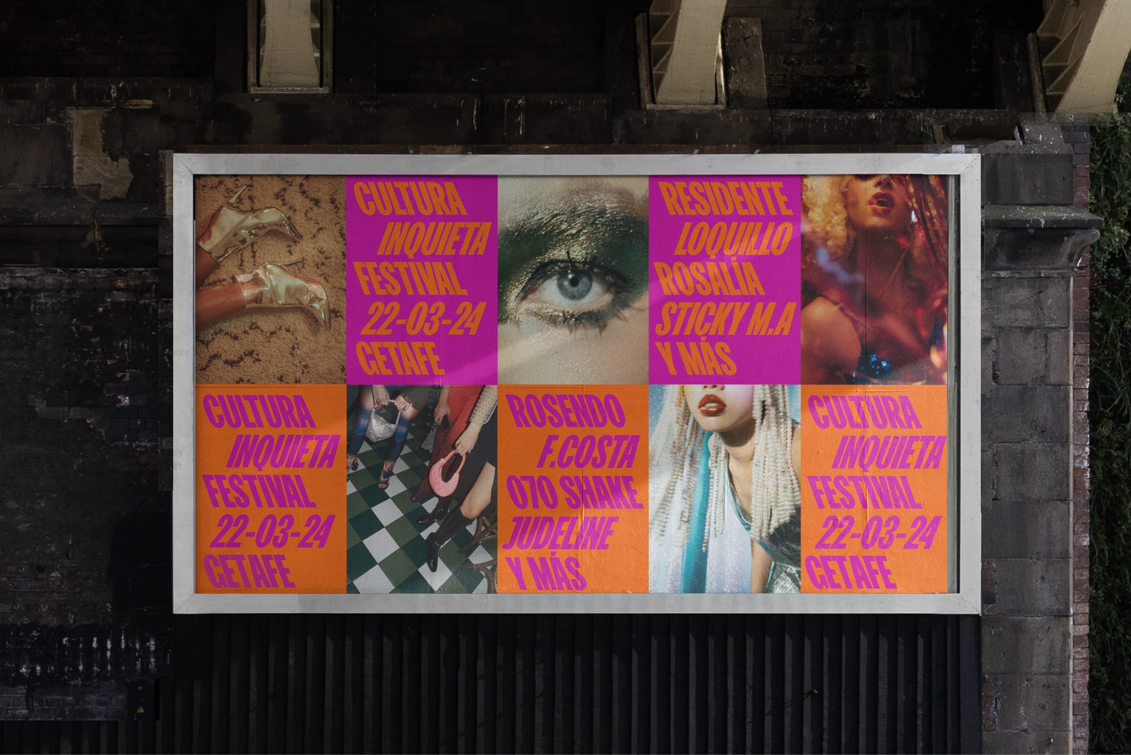
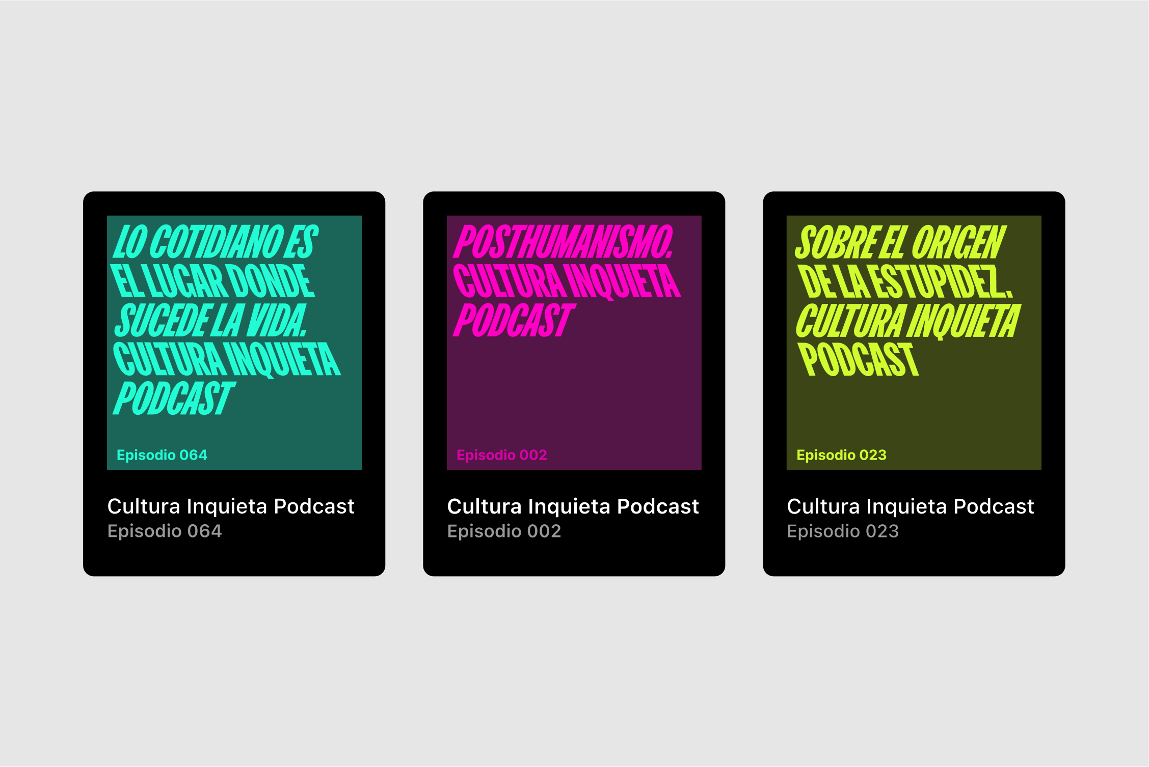
In order to evolve with all the new changes to come, Paseo develops a graphic system that adapts and transforms to accommodate new brands in the group. From the festival, to talks, events, podcasts and more, everyone has its space.

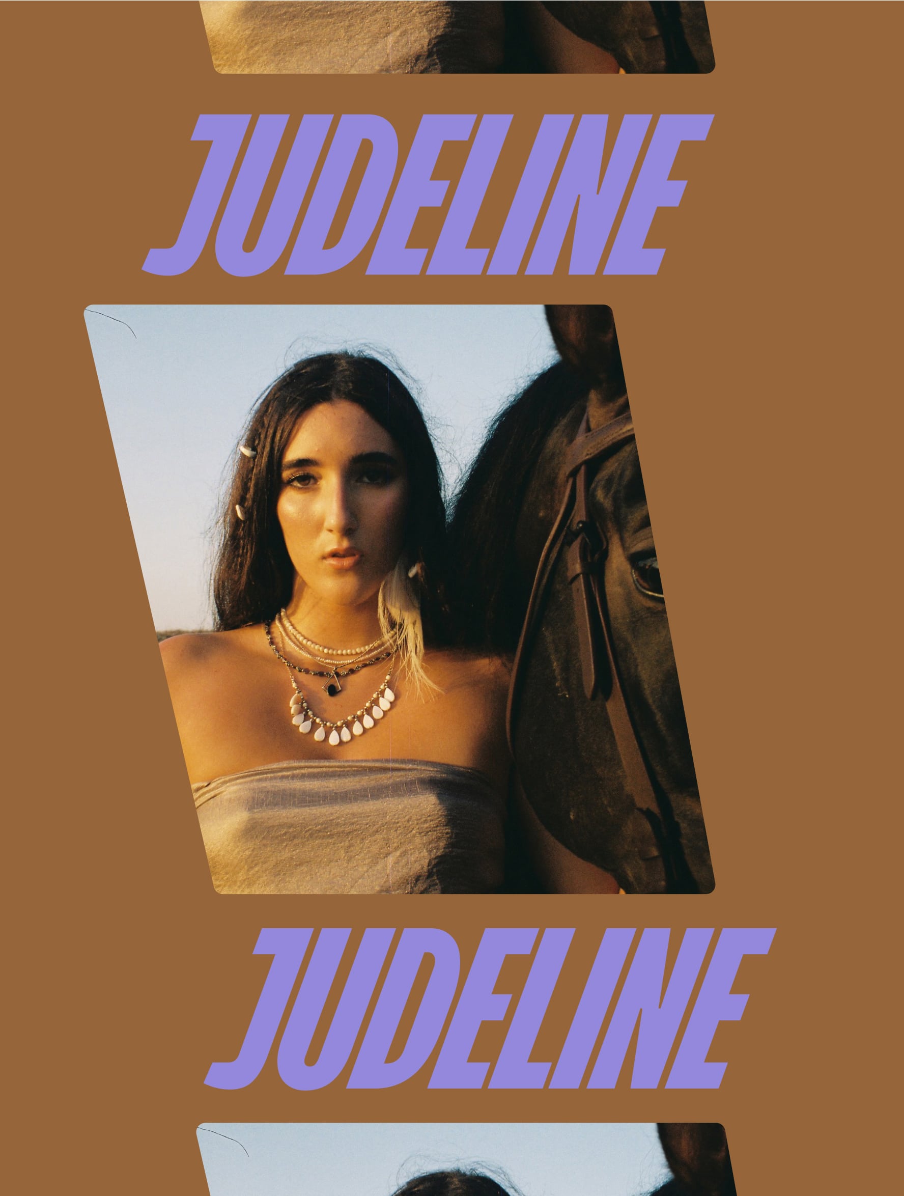

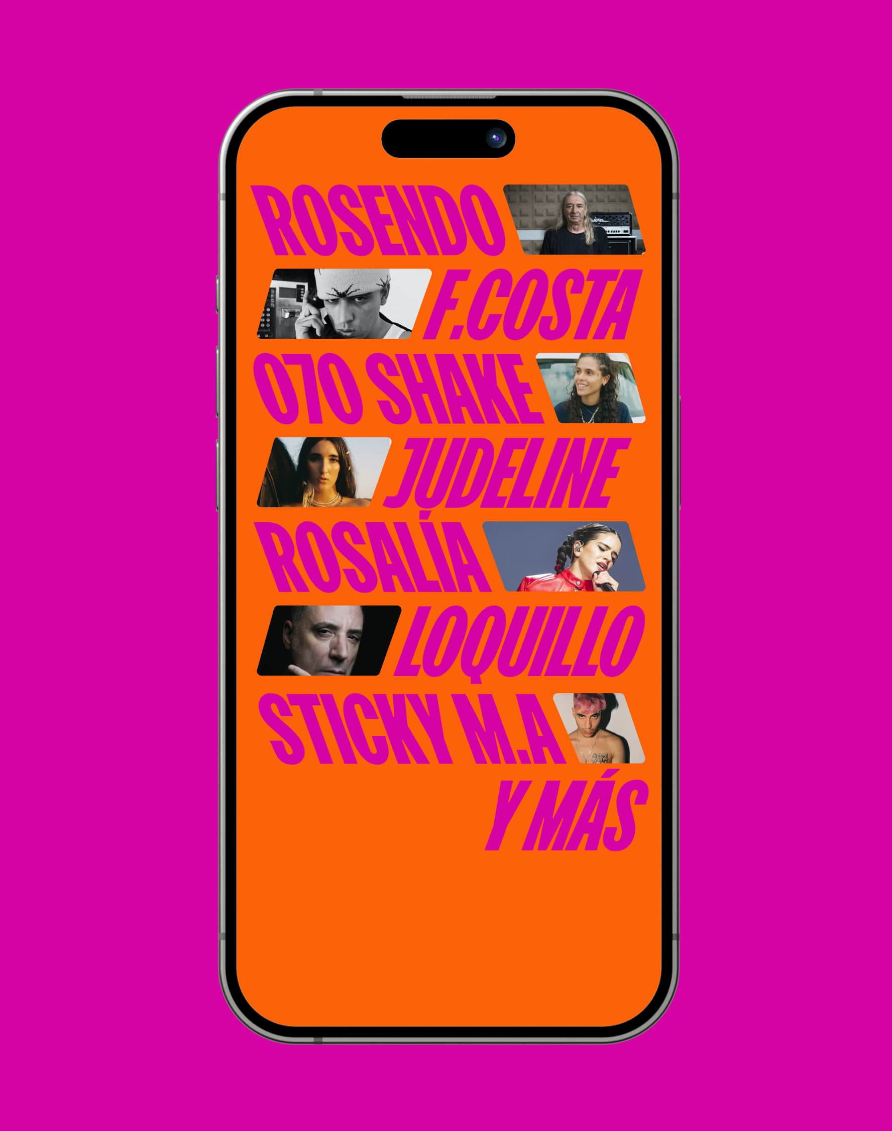

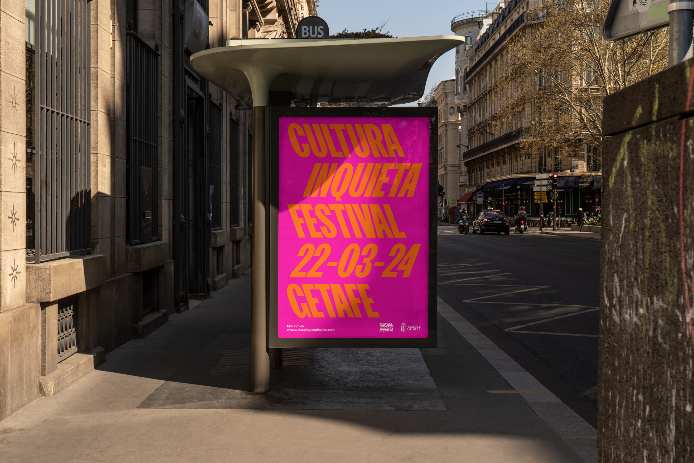
Bright, fun and complimentary colors are selected to portray a new era for the Festival.
Clashing tones and surprising choices in creative color combinations connect with new audiences while being able to preserve their fanbase. With a combination of slanted and back-slanted features in the logo, an engaging visual system portrays the festival’s lineup in a versatile and striking way.


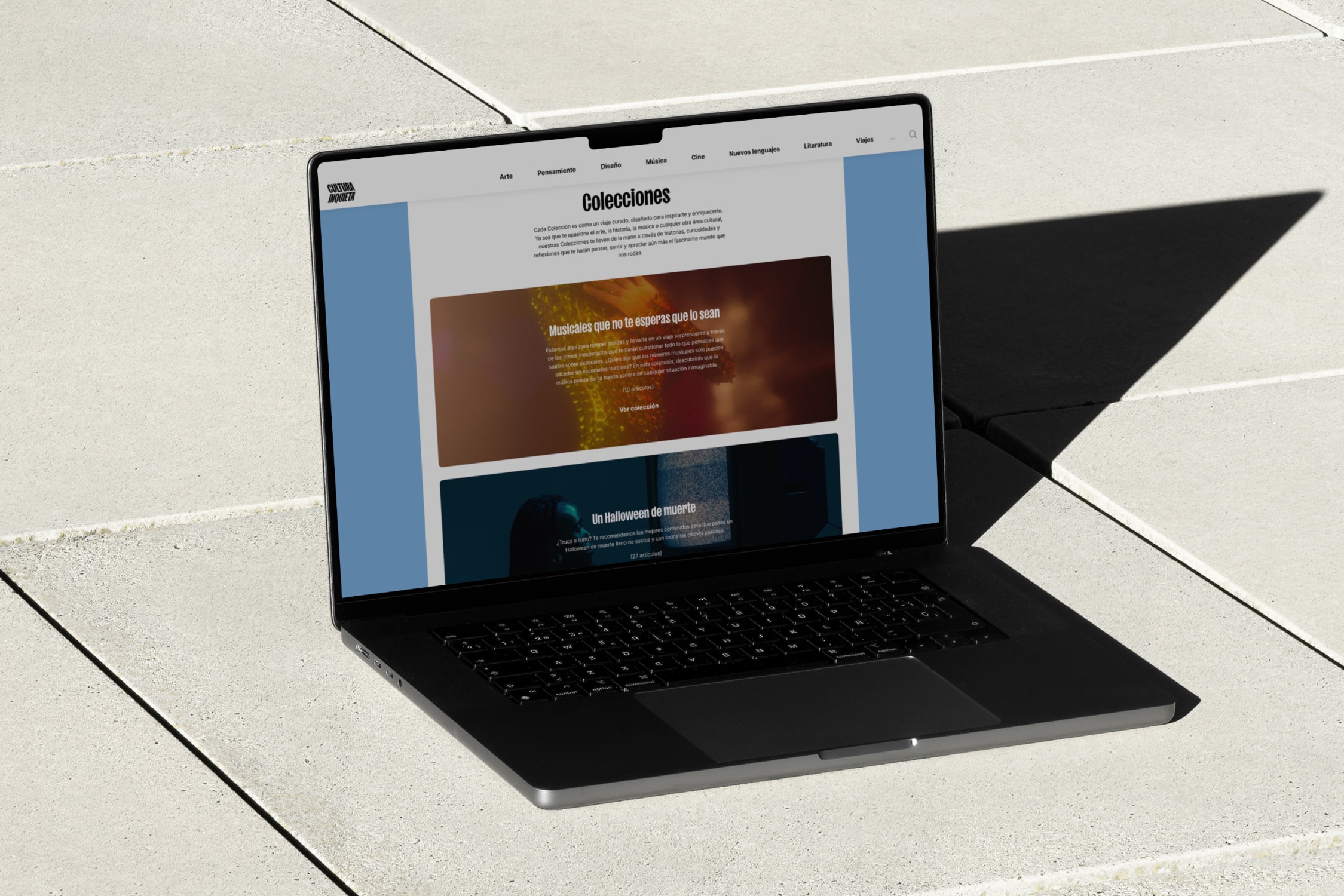


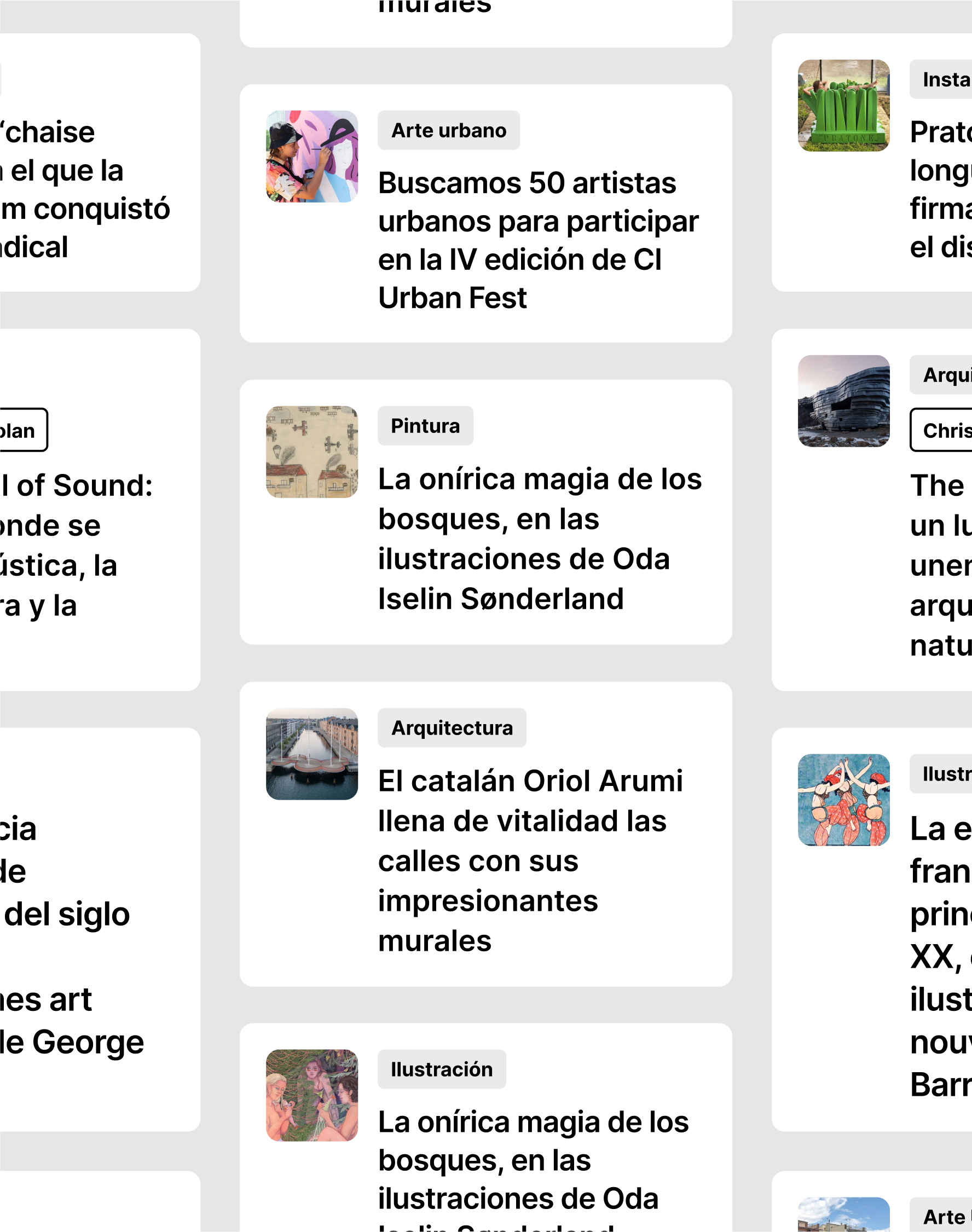
Cultura Inquieta’s website is their biggest channel, filled with articles, interviews, and news that needed a new home.
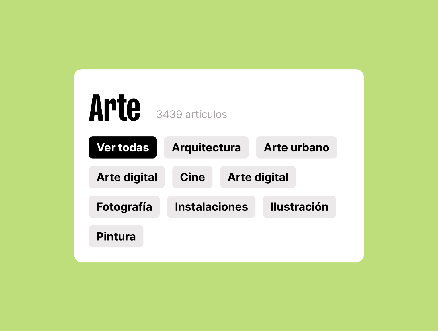
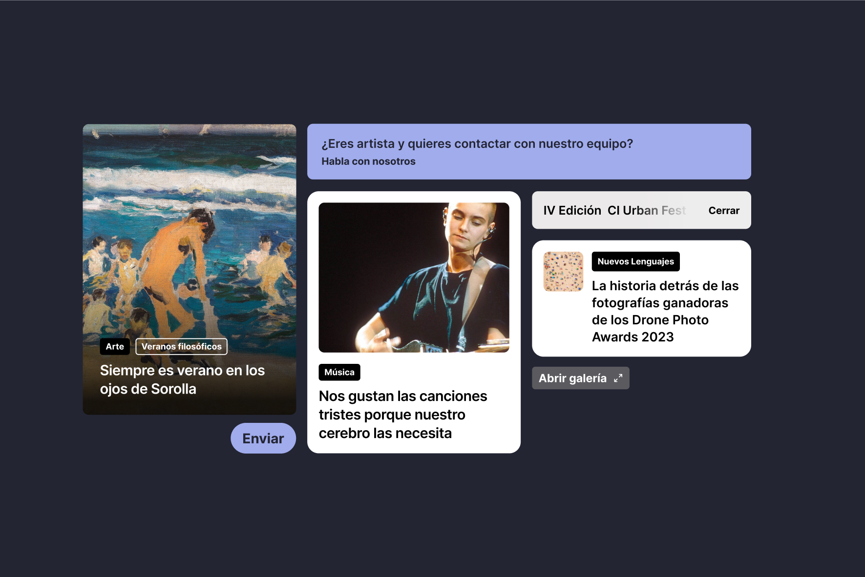
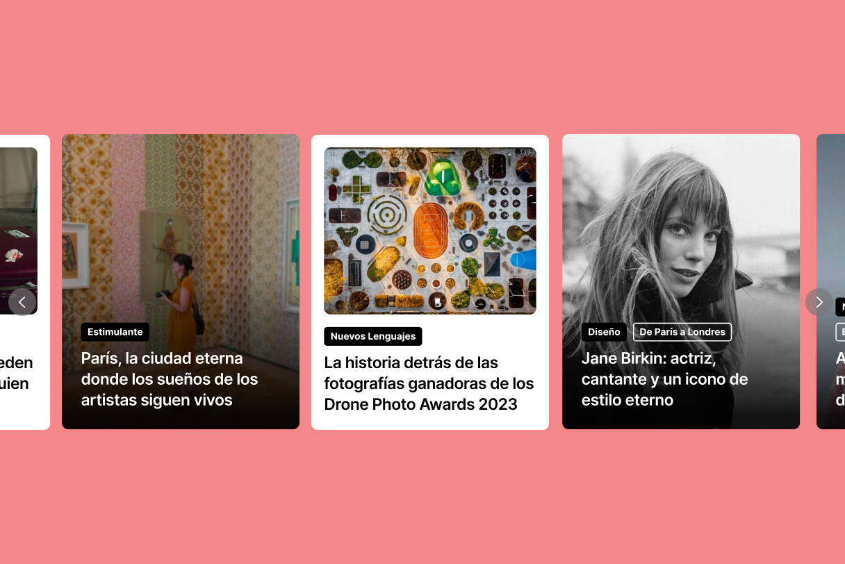
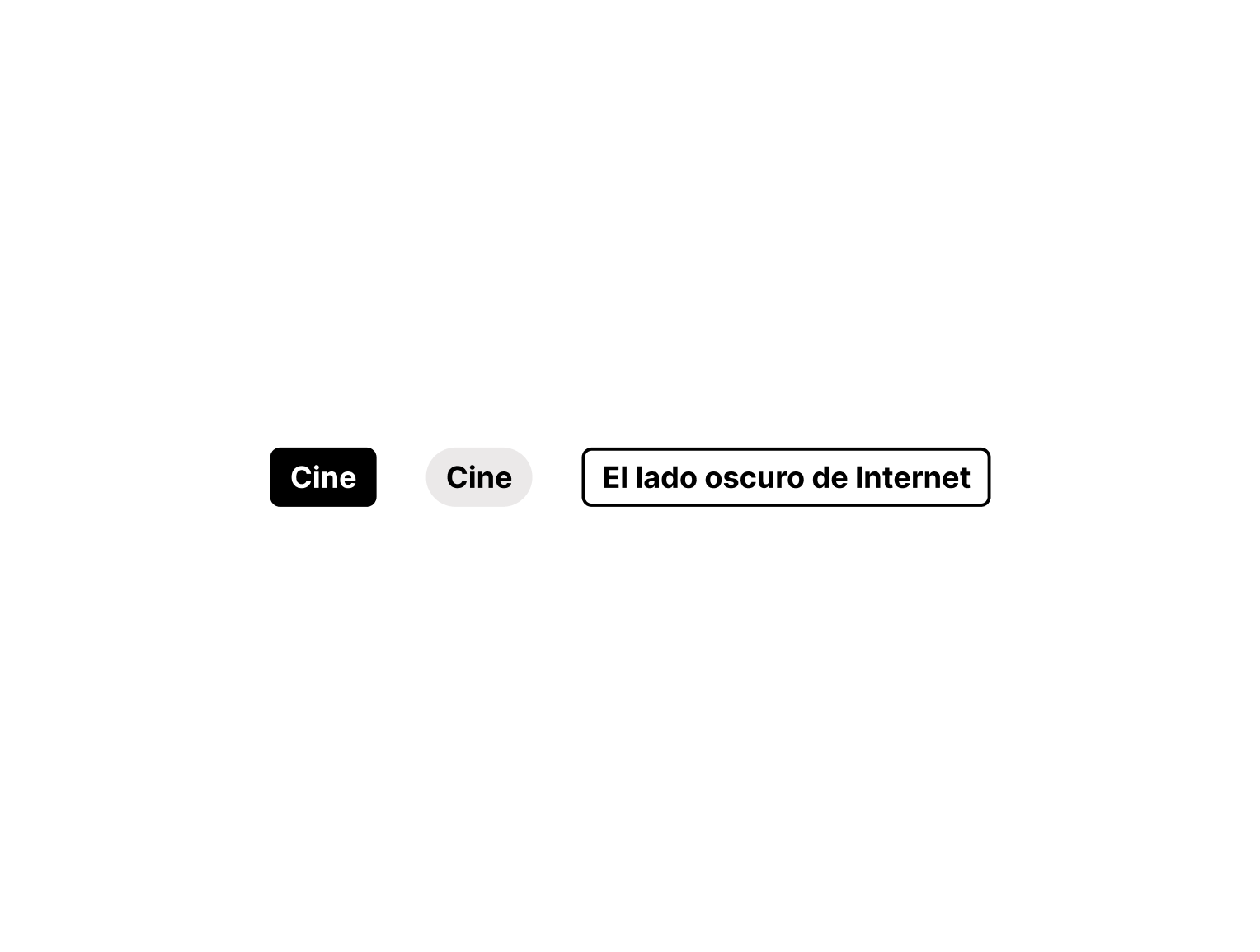
Paseo takes on the task to redesign it from scratch, taking it from a blog-style, cluttered website to a more forward-looking website, with A new organized system for tags and categories obtained during the workshops together with the CI team. Typography is crucial for this change: headlines get bigger and high readability fonts are chosen to create a seamless navigating experience. Fun is not sacrificed, though, with a bold use of colors and images.
An identity on the move for an ever-changing community of creatives.
«From the very first day that we sat down with Paseo to present them with the brief, we knew it had to be them. It was a long and intense collaboration and they managed to capture exactly what we needed for this new moment with our rebrand.»
Patricia Lietor, Partner and Head of Marketing & New Business

