—Xtadium
Feel the game for real












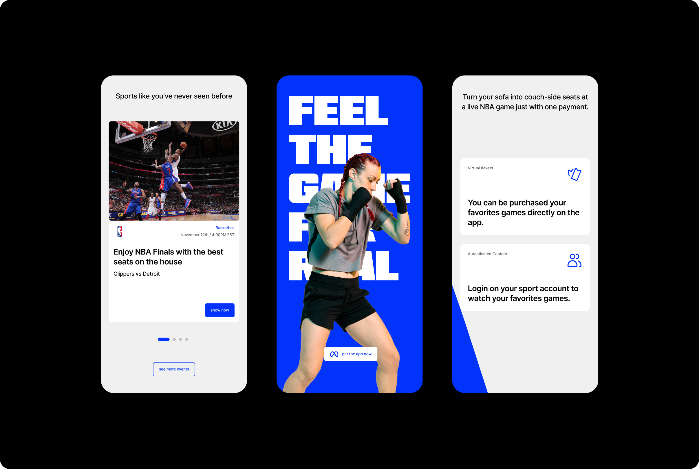


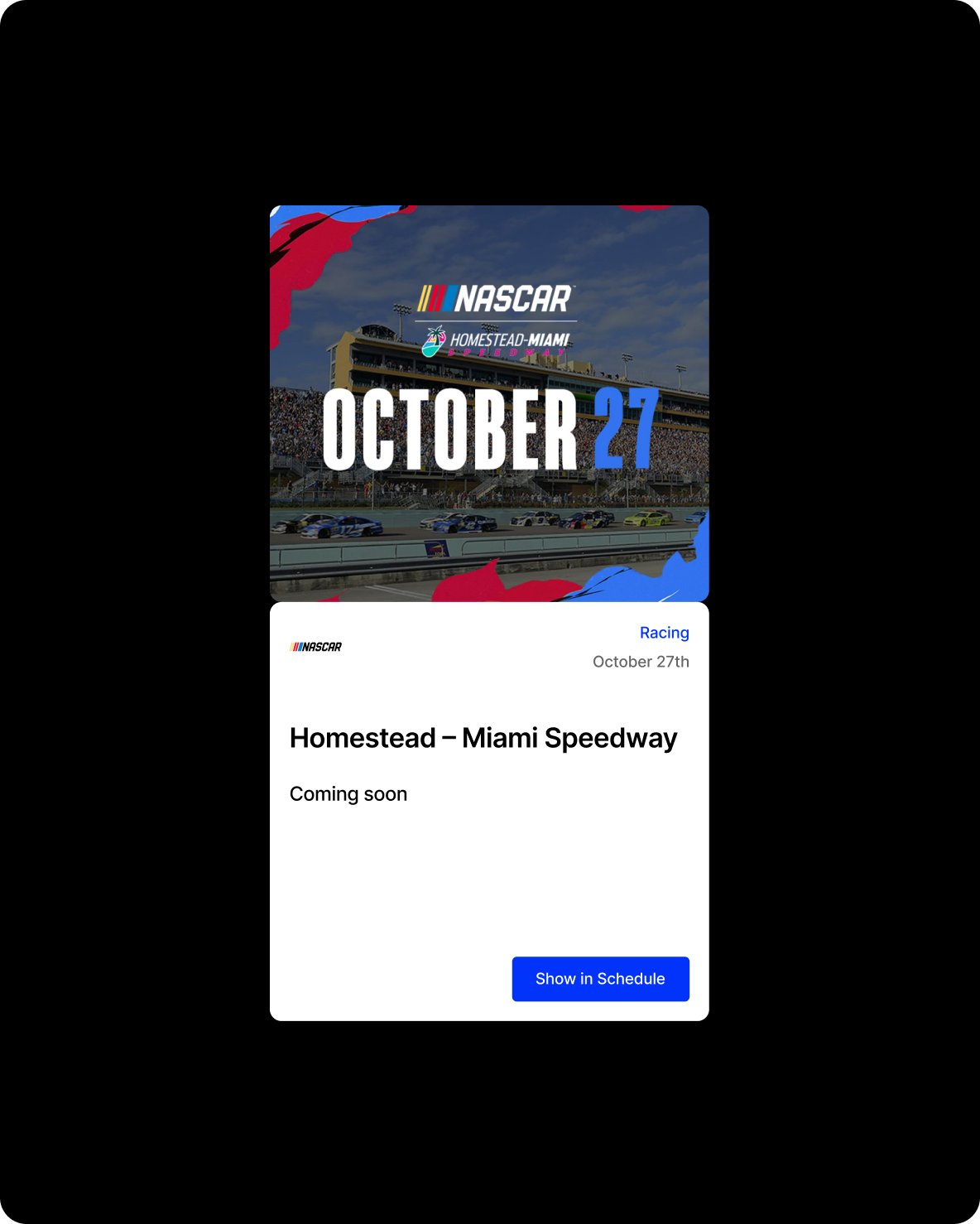
Xtadium is the premier, co-watching VR sports hub featuring live, on-demand, and pay-per-view access to the world’s most elite sporting events.
We partnered with Xtadium’s design team to develop a brand identity that reflects their immersive experience.
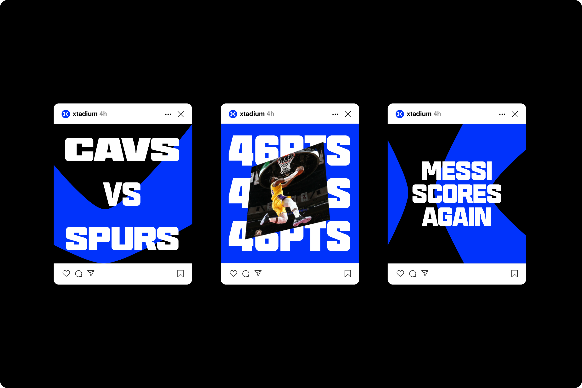
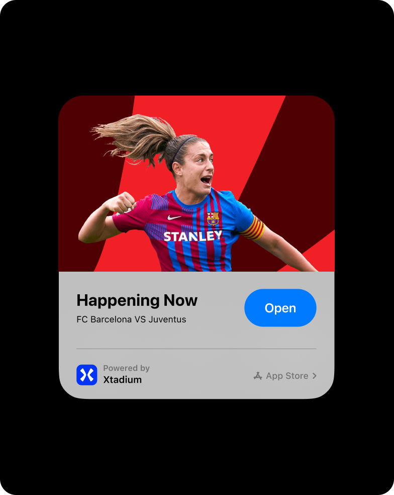
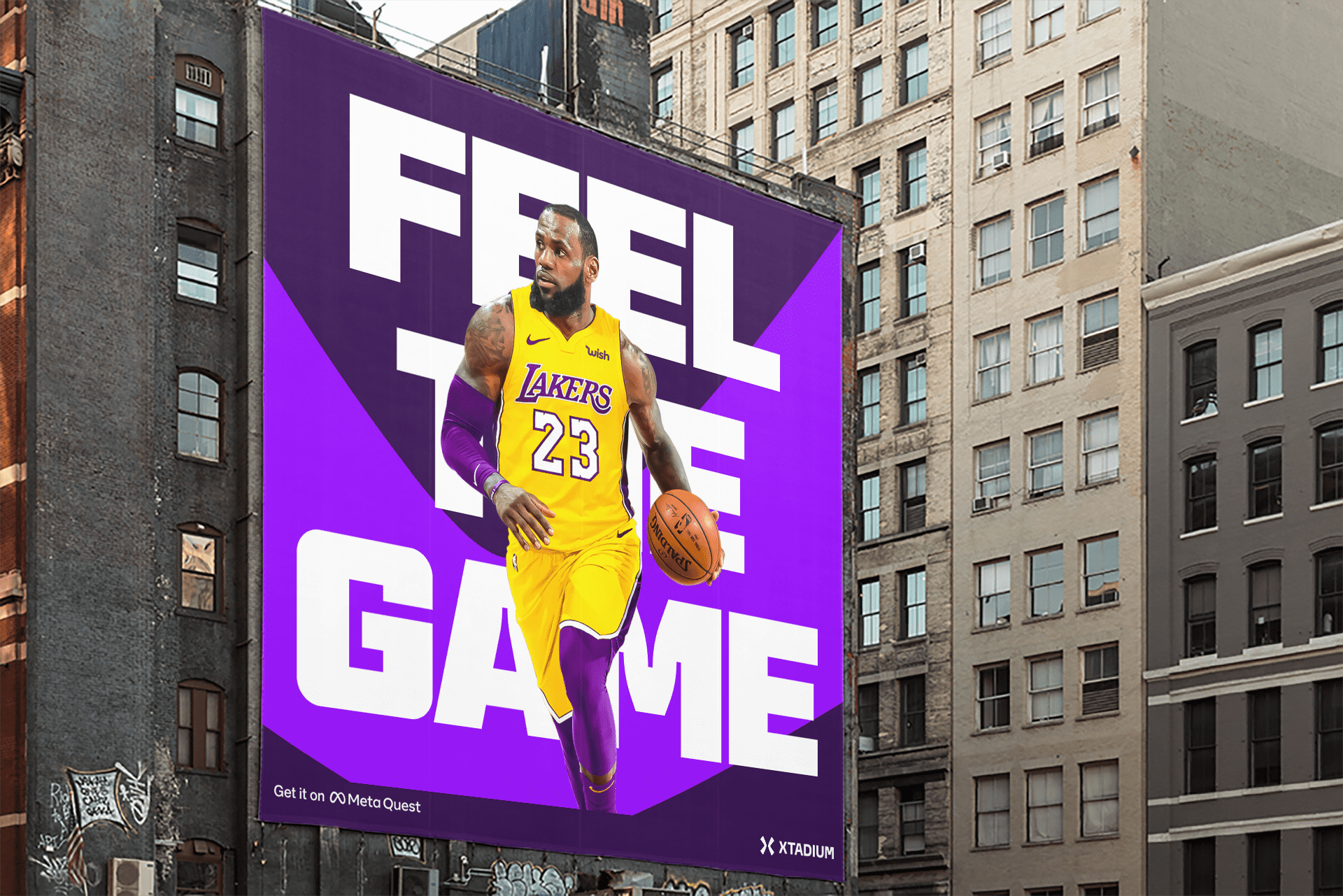
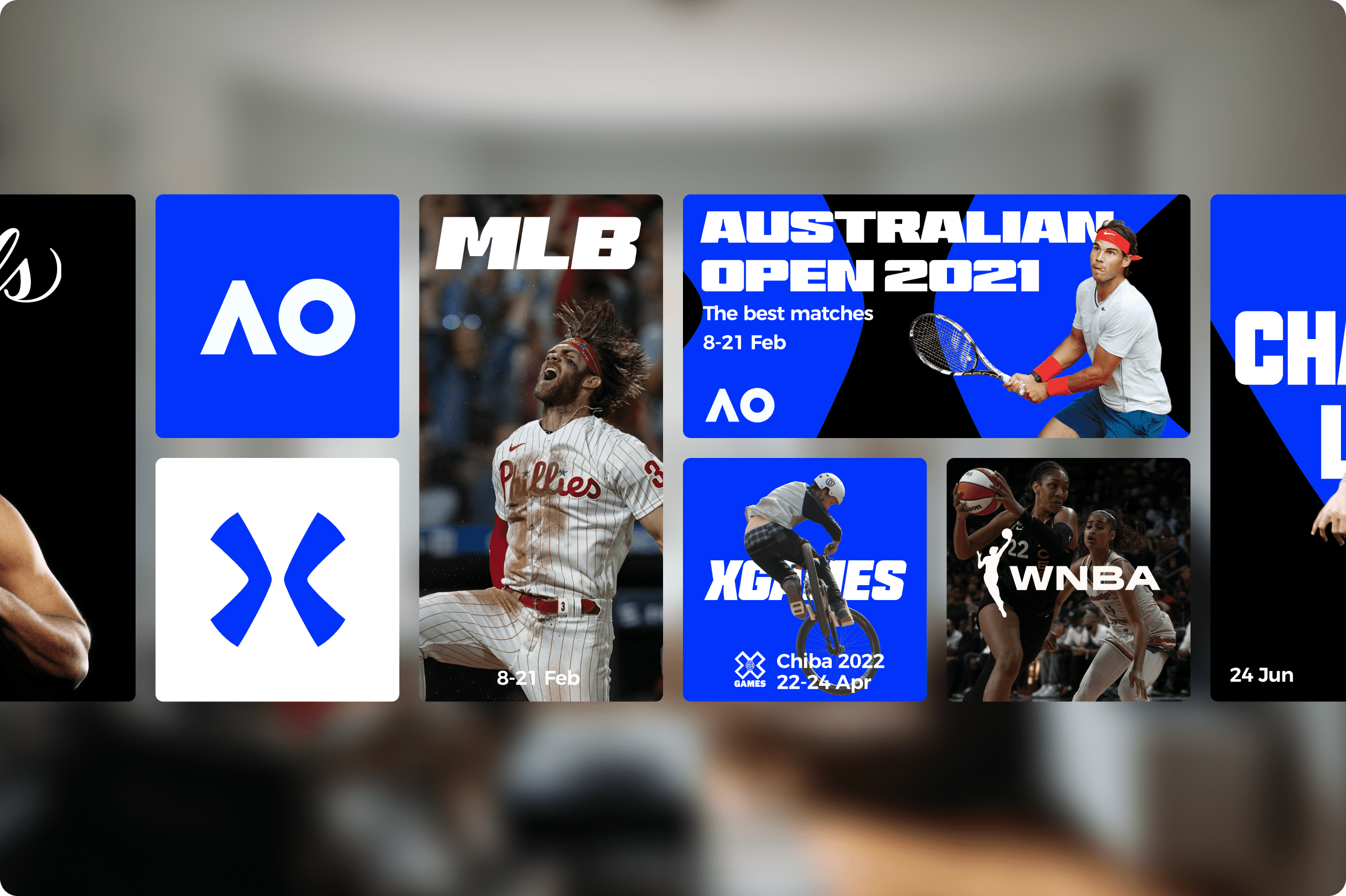
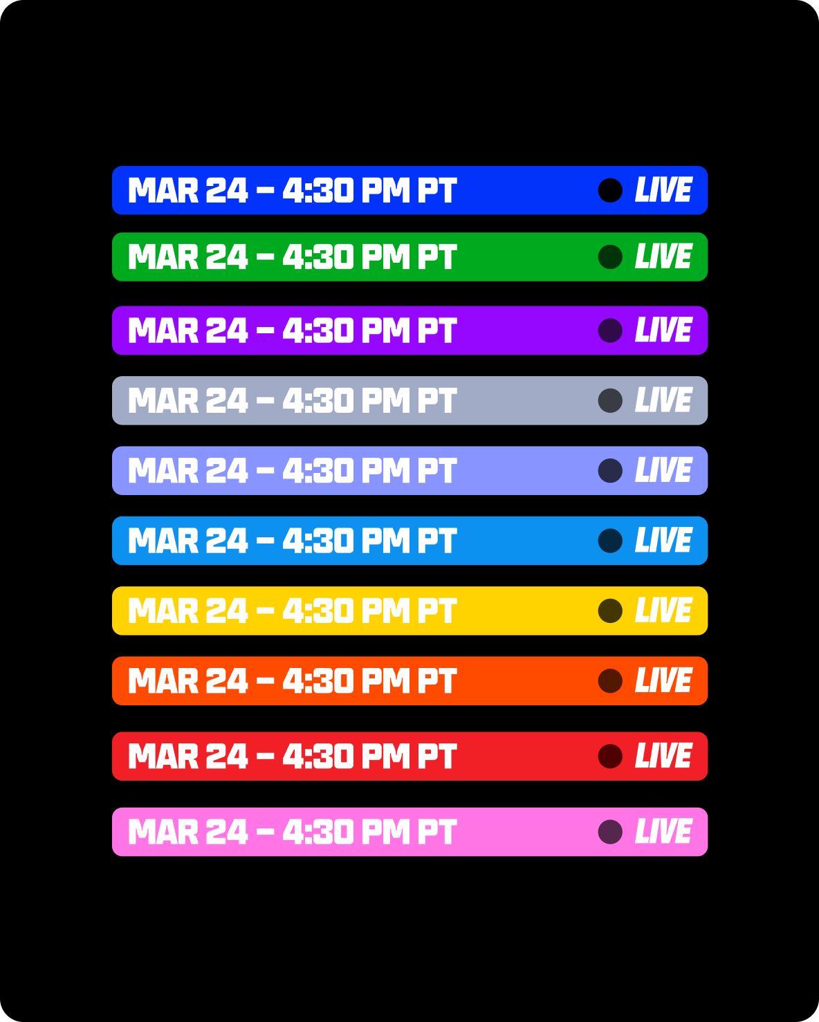
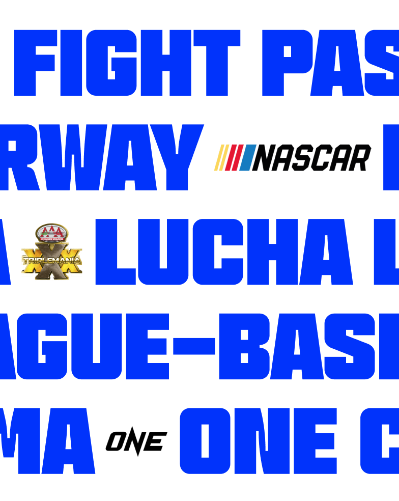
As the VR experience, we designed a logo where you can be inside, an element that can be felt around but also has a meaning from the outside. The translation to the 2D world of an 3D element and vice-versa. Typography is a crucial element in the identity system, not only for pushing up headers in a bold and powerful way, but also working as a background pattern that mix form and content. With the aim to provide maximum flexibility, our visual system works in layers, letting the design team combine the different element creating a wide, variate range of outputs.
Special thanks to Ophion.
Font used in this project is BT Brick by The Designers Foundry.


