—ETPay
Improve your sales with cardless payments



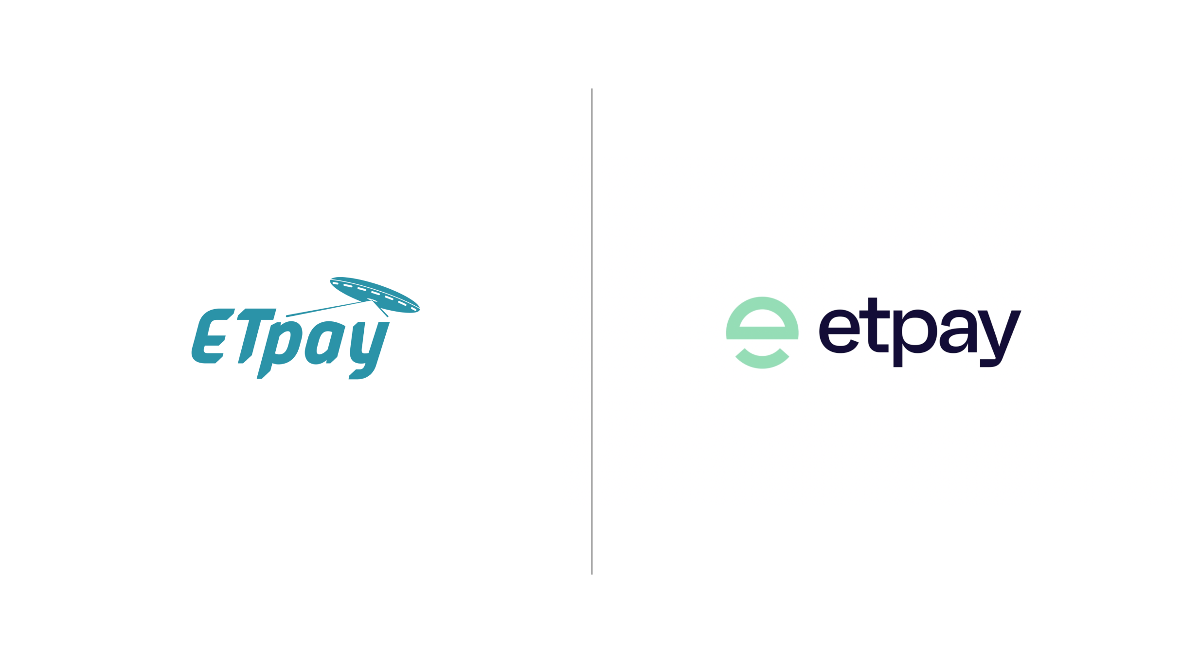








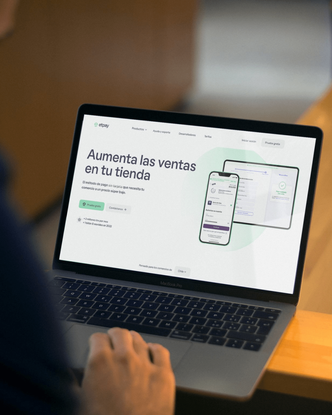
Would it be possible to use a payment gateway without needing a credit card? ETpay, Chile’s leading company in payment by bank transfer for commerce, was inspired by this question
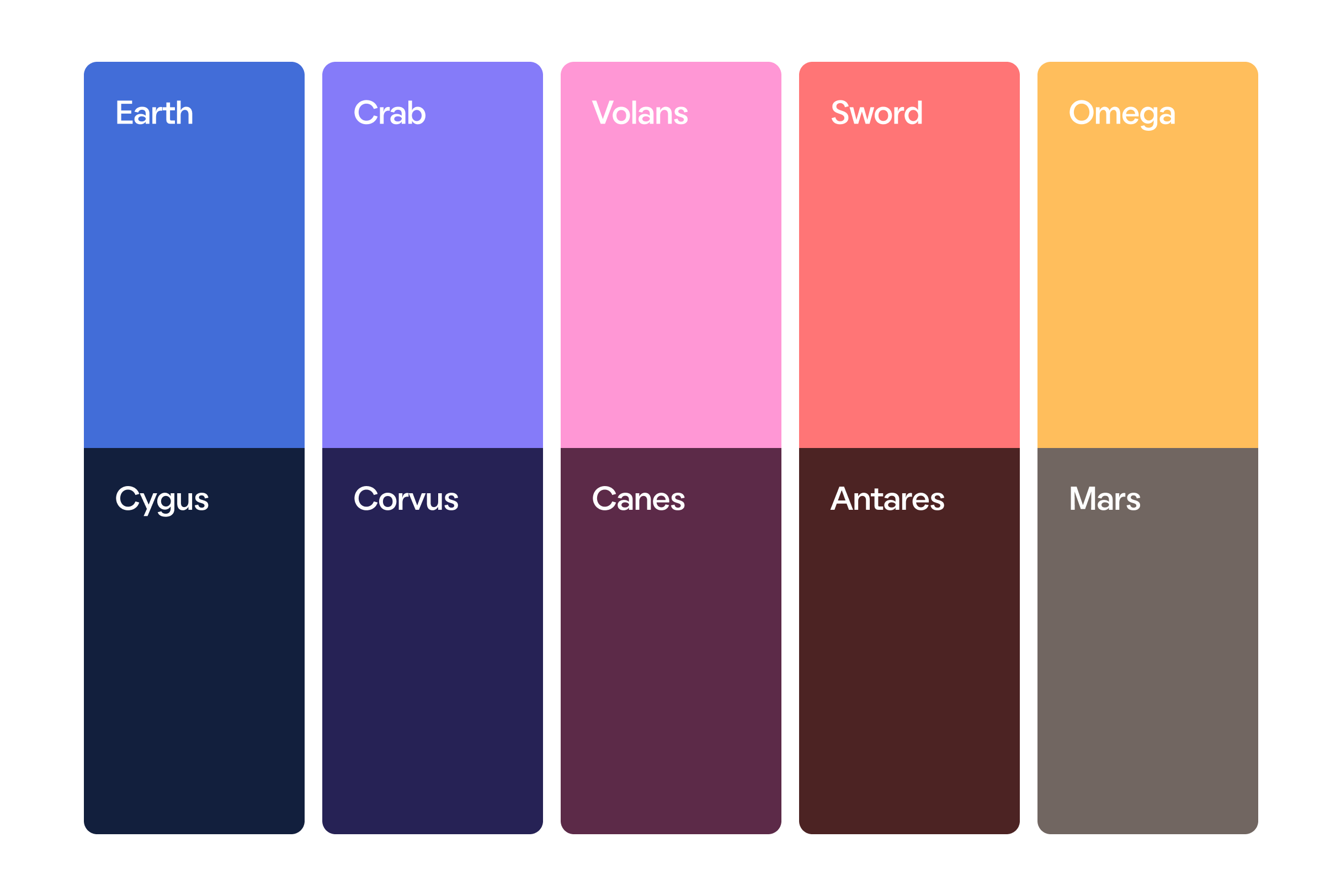
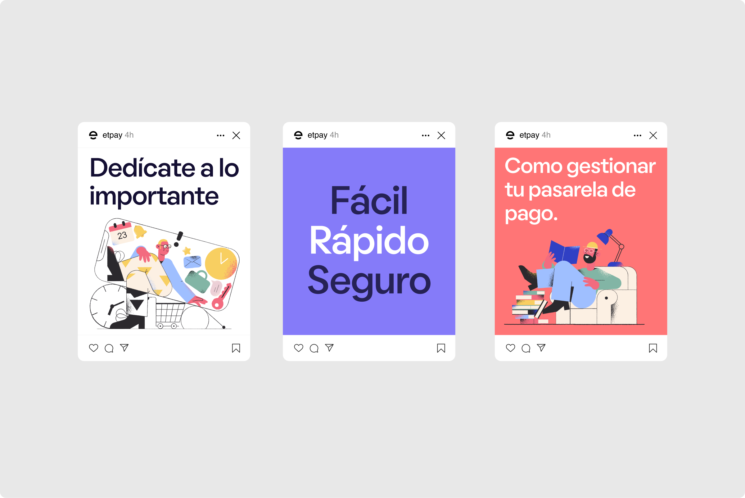
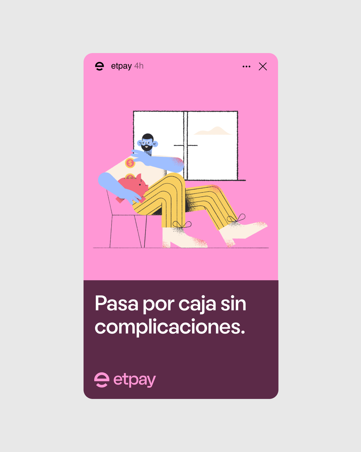
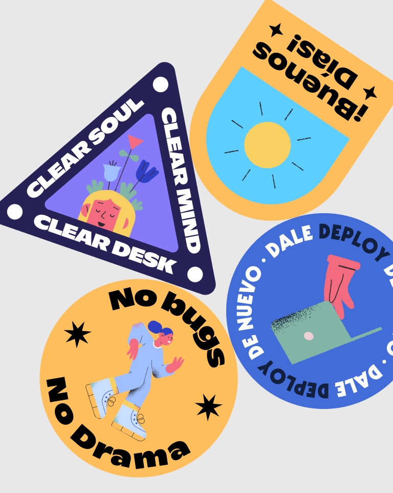
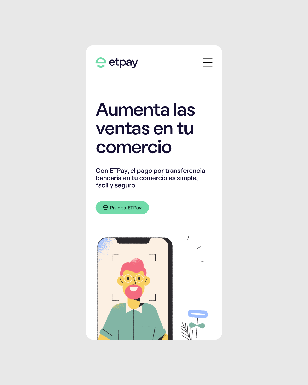
With the objective of growing on the American market, we redesigned their identity and visual language. We added a boost to the original color, bringing it closer to contemporary digital language. Additionally, the warm secondary palette broadens the register of communication. The UFO is still an essential part of the identity, but it is in movement, and also fused with the E, creating a loaded, expressive symbol.
Special thanks to Fernando Roldán (UI/UX)
Font used on this project is Oatmeal by Boulevard LAB Type Company

