—Music Fingers
Music at your fingertips.
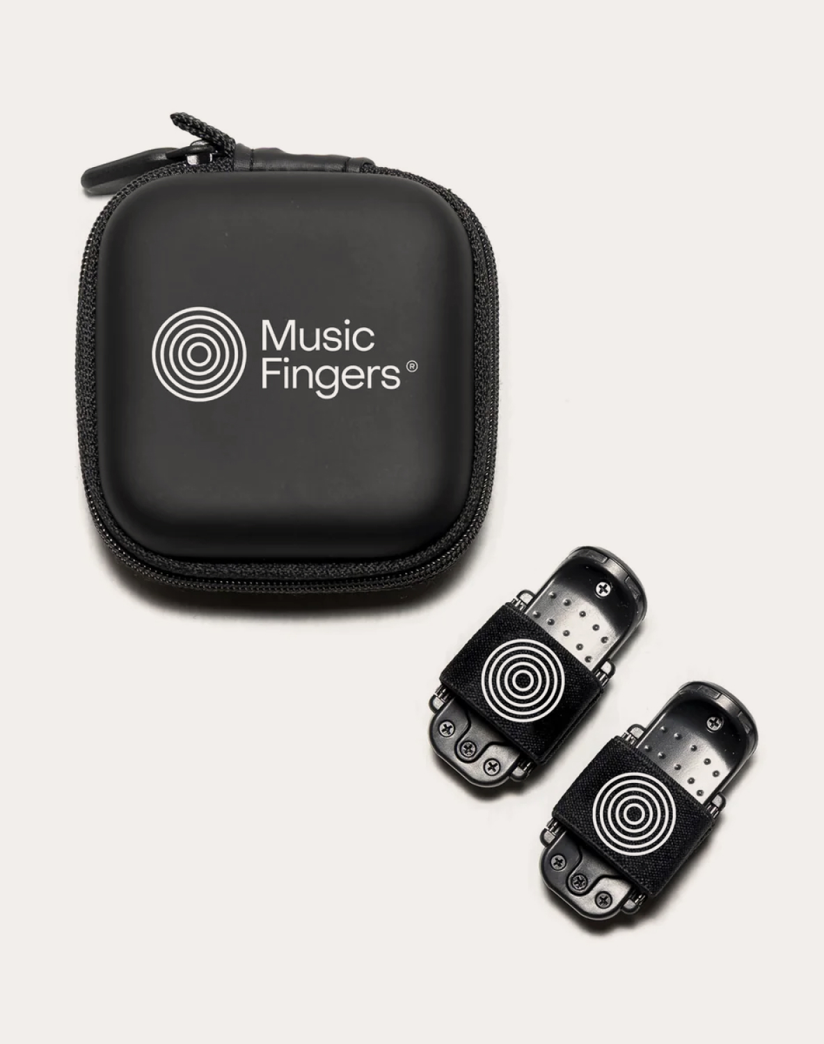
Music Fingers is the wearable instrument that allows users to create sounds and songs with the tap of a finger. A disruption in the music industry, in the palm of your hand.
The team behind Music Fingers, a group of friends united by their love of music, came together as amateur and professional musicians to create an innovative tech product that brings the possibility of making music everywhere. Just by using their fingertips, people can create melodies and layers of sounds wherever and whenever they want. The freedom to play music without limits.
The challenge we faced was to update the product’s identity while designing the application’s UI at the same time, all within a tight timeframe of approximately three weeks before user testing.
The revolutionary device that puts music creation at your fingertips.
For the brand identity, we drew inspiration from the concept of «pulse.» This relates to the body part—the finger or fingerprint—that the user utilizes to create music when interacting with the device. The notion of a musical pulse was also a guiding influence. These ideas culminated in the creation of a minimalist, circular symbol that encapsulates these concepts.
Nahúm García, the Lead Designer of the project, provided an excellent foundation for us with his earlier UX work. He simplified the app’s previous interactions, enabling us to start with realistic wireframes to implement visual design.


“When it came to finding someone to handle the visual design for our app, the choice was clear — Paseo was the perfect fit. I had been following their work for years and they consistently deliver delightful and on-point projects. Collaborating with them on this particular project was a breeze; we quickly reached an agreement on scope, timeline, and budget, thanks to their straightforward approach. The work itself was fluid, easy, and incredibly satisfactory.”
Nahúm García, Lead UX Designer of Music Fingers


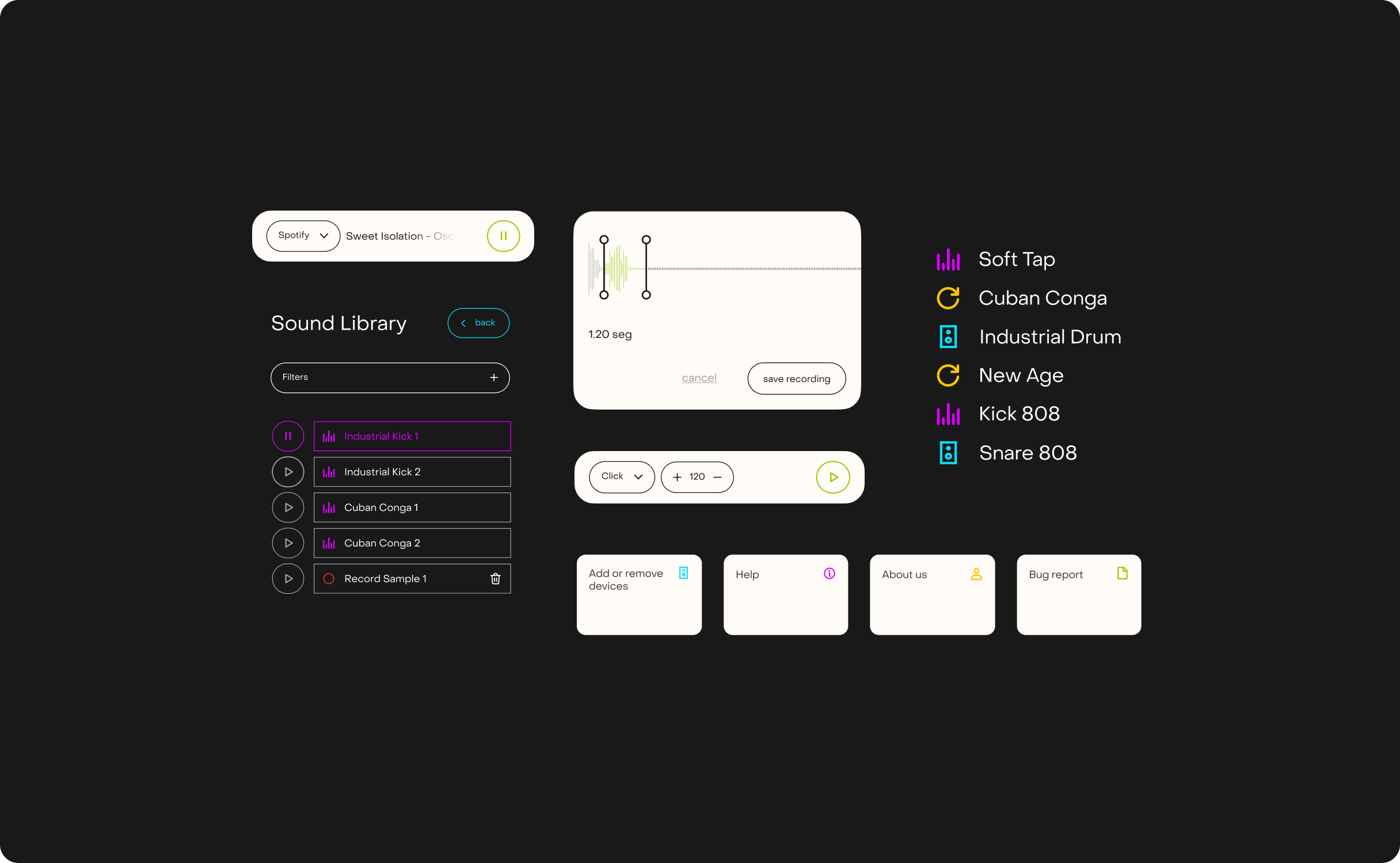
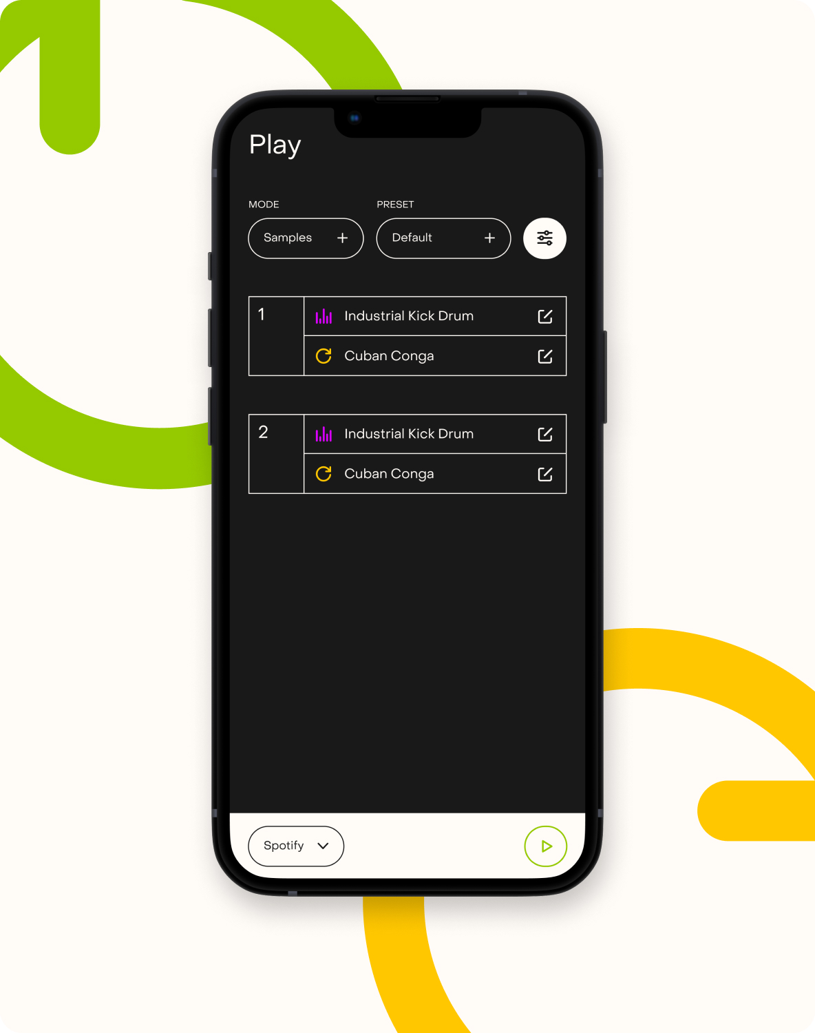
The objective was to imbue the app with a flat design aesthetic, aligning it more closely with professional sound software by using dark backgrounds. The design prominently features lines, which directly correlate with the pulse symbol that serves as the brand’s motif.
We also created easily recognizable icons for artists and musicians, such as samplers and loops. These icons serve to introduce points of light, differentiation, and movement to the app’s interface.
“Paseo’s contribution went beyond mere visual design; they also proposed refinements to various branding elements, resulting in a more cohesive and compelling project narrative. The final outcome surpassed everyone’s expectations and added significant value to our endeavor. Choosing to work with them was undoubtedly the best decision I could have made.”
Nahúm García, Lead UX Designer of Music Fingers


An identity inspired by music and tech, from professional editing softwares to user-friendly streaming apps.
Special thanks to Nahúm García (UX) and Ophion Studio (App Development).
The typography on this project is PP Object Sans from PangramPangram.

