—Silbo
Easy as a whistle
An identity that is light as air for a product that is a easy as a breeze. Because using Silbo is the easy choice.
Silbo is an app that allows users to send money directly through WhatsApp. Designed to be easy to use, everyone can quickly send money to their contacts through a simple chat, making the process of sending and receiving money simple and straightforward.
Juan Ramirez, from Brands of this Century, was in charge of naming and strategy for the app and invited us to work on the brand identity, commercial website and onboarding.
Silbo’s focus on simplicity translates into an effortless brand, with minimal brand elements that emphasize clarity and ease of use. Born from the brand idea, “you don’t need another app”, the identity reflects on a life without complications.
The clean, straightforward logo is composed of a geometric font where the dot of the “i” is displaced to generate movement, in the same way your money moves with Silbo.
The color palette is reduced to the minimum, with the use of white and navy blue as a base and a vibrant, sour yellow as the accent color.

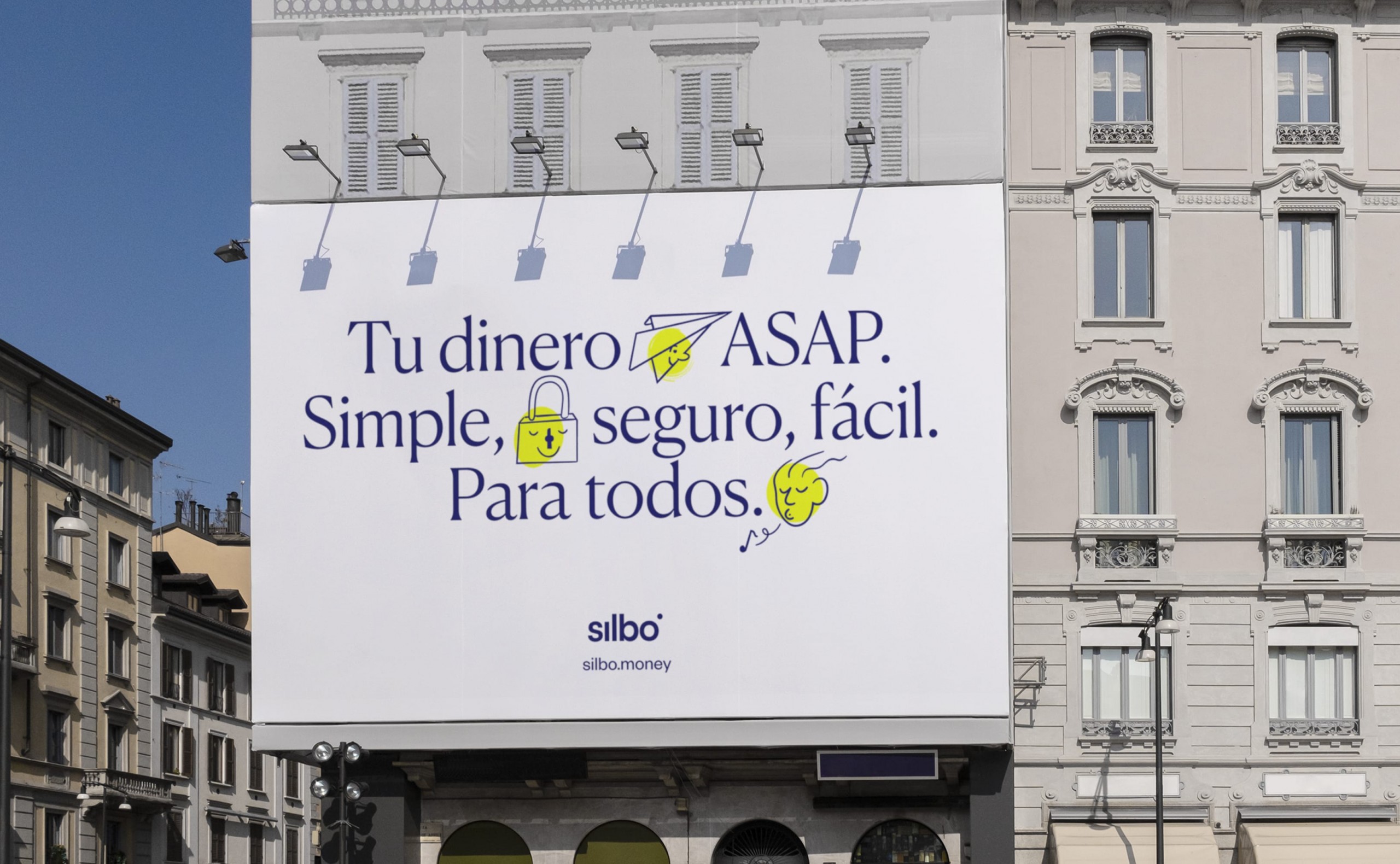


Typography wise, we decided to stray away from the digital bank style and work with more editorial typefaces that gave the brand a more elevated look. Canela, an elegant but contemporary serif is used for headings and Founders Grotesk is the sans chosen for the bodycopy.
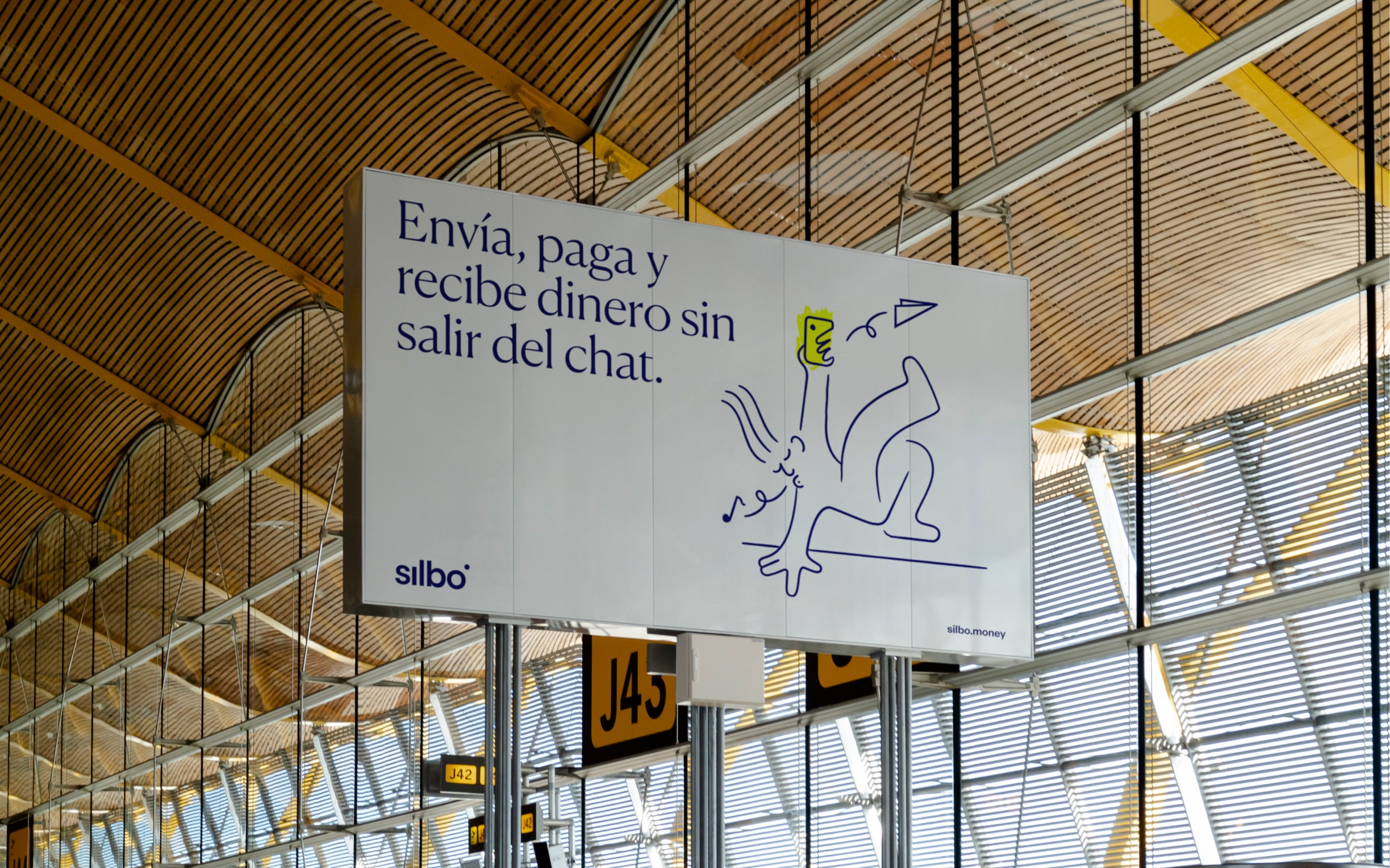
The illustrations complete the brand message, representing the idea of simplicity by showing that Silbo is so easy to use that you can do it while doing things as complicated as frying an egg up in the sky, reaching nirvana or breakdancing. The clean, light style applies to the main brand illustrations as well as the illustrations on the website messages and the transactional, digital icons.
The best thing about working with Paseo has been their ability to adapt to the different changes in the course of the project, always with great commitment and a high quality of delivery.
Luis Cantero — Silbo Founder


What led me to choose Paseo as the right partner to build the brand for a disruptive fintech startup, is that they truly understand the game of transformative branding. Their work was not only informed by clear design imperatives (simplicity, immediacy and relevance) but also informed by a genuine understanding of the strategic imperatives that would position the brand in the market, in this case radical simplicity and inclusiveness. They did this in an elegant, effortless and egoless manner. This for me is a rare and precious alchemy in a design studio.
Juan Ramírez — Brands of This Century Founder

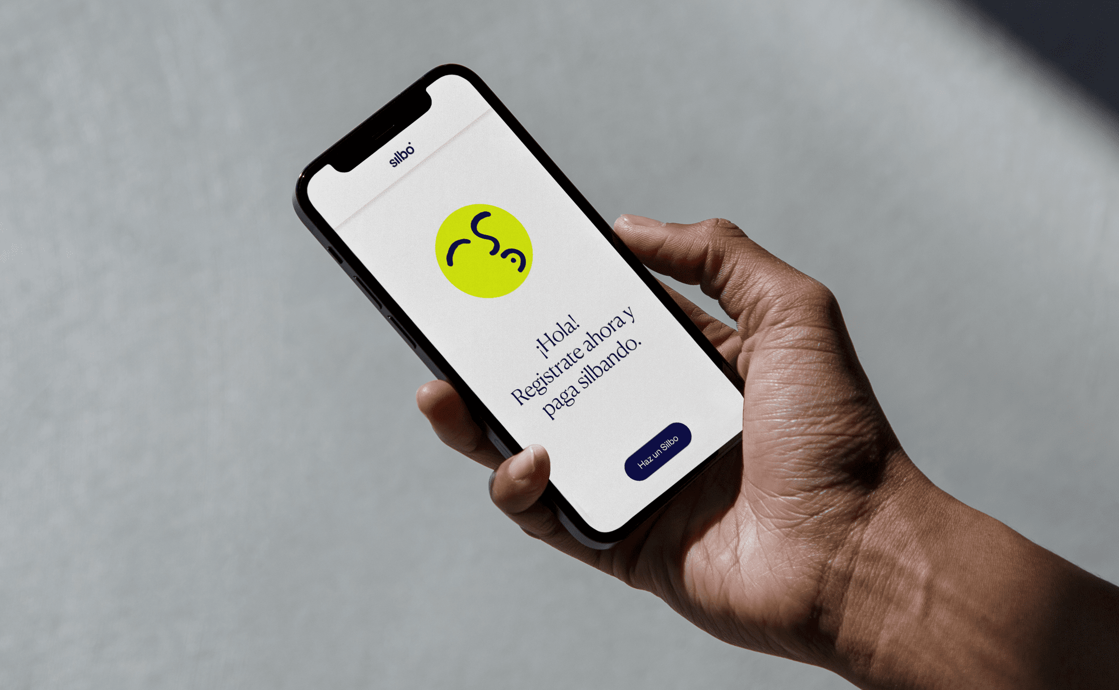
The Silbo avatar represents the more playful and kind character of the brand. A carefree, whistling face acts as the badge of the app, social media profile pictures and more.
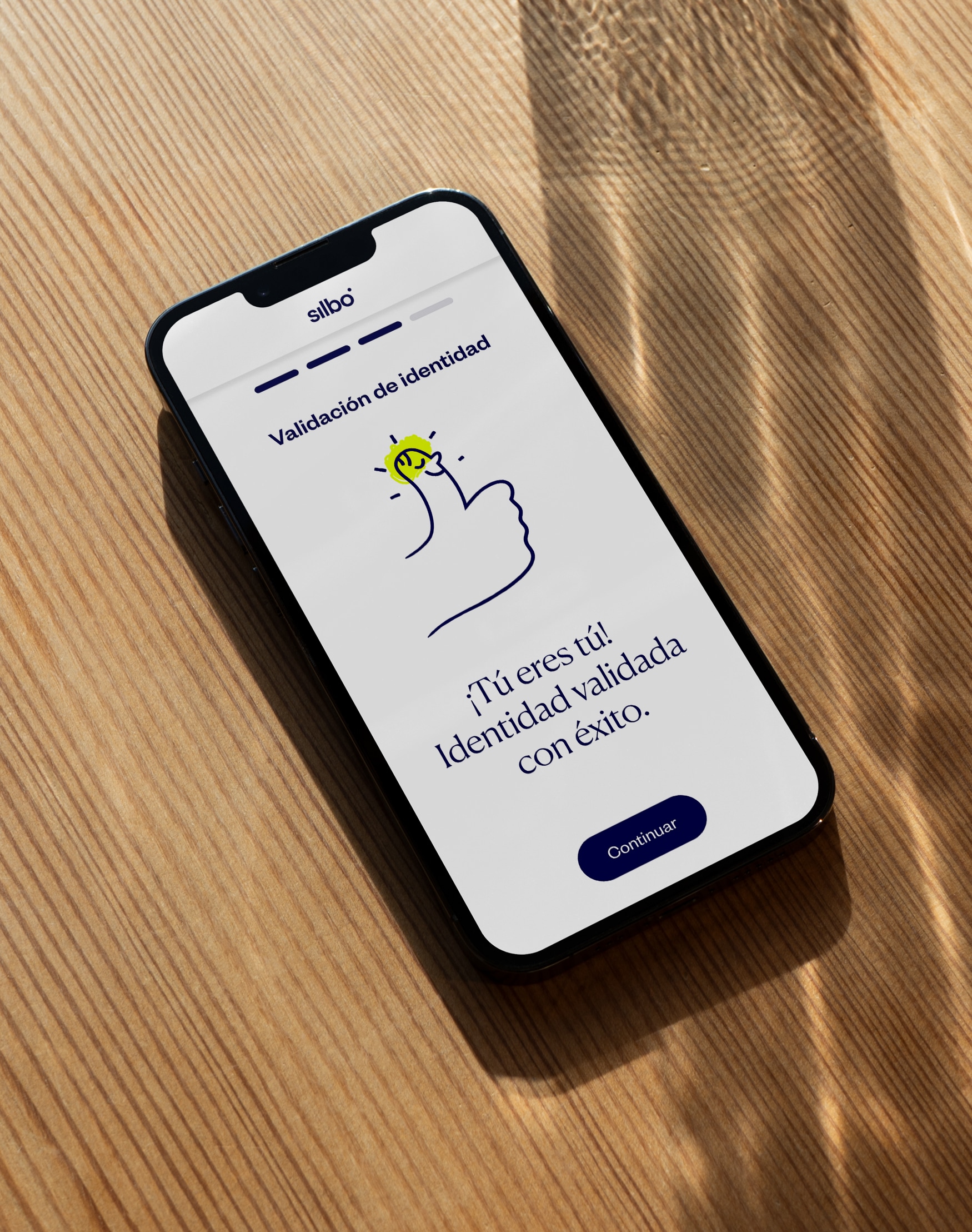
Paseo also worked on the onboarding screens, acting as the bridge between the development and business teams. Users’ first contact with the app is the onboarding or registration process, where the main goal is to convert site visits into sign ups and secure their first payment. Making it easy, enjoyable and secure at all times was the challenge to overcome. A lot of sensitive data is collected in the process and the concept of simplicity in the product had to permeate these screens as well.


Both the interface design (UI) and the UX writing in this phase were aligned with the brand image, to achieve an easy and clear onboarding in as few screens as possible. The commercial website matches the brand’s idea of simplicity. We built a one page with very clear messages and fun illustrations to communicate the benefits of Silbo in an effective and entertaining way.


Special thanks to Juan Ramírez (Strategy Director), Ophion Studio (Development), Silbo Team, Pedro Perles (Illustration), Jaime Liñán (Brand Identity).
Fonts used in this project are Canela Deck by Commercial Type and Founders Grotesk by Klim Type Foundry


