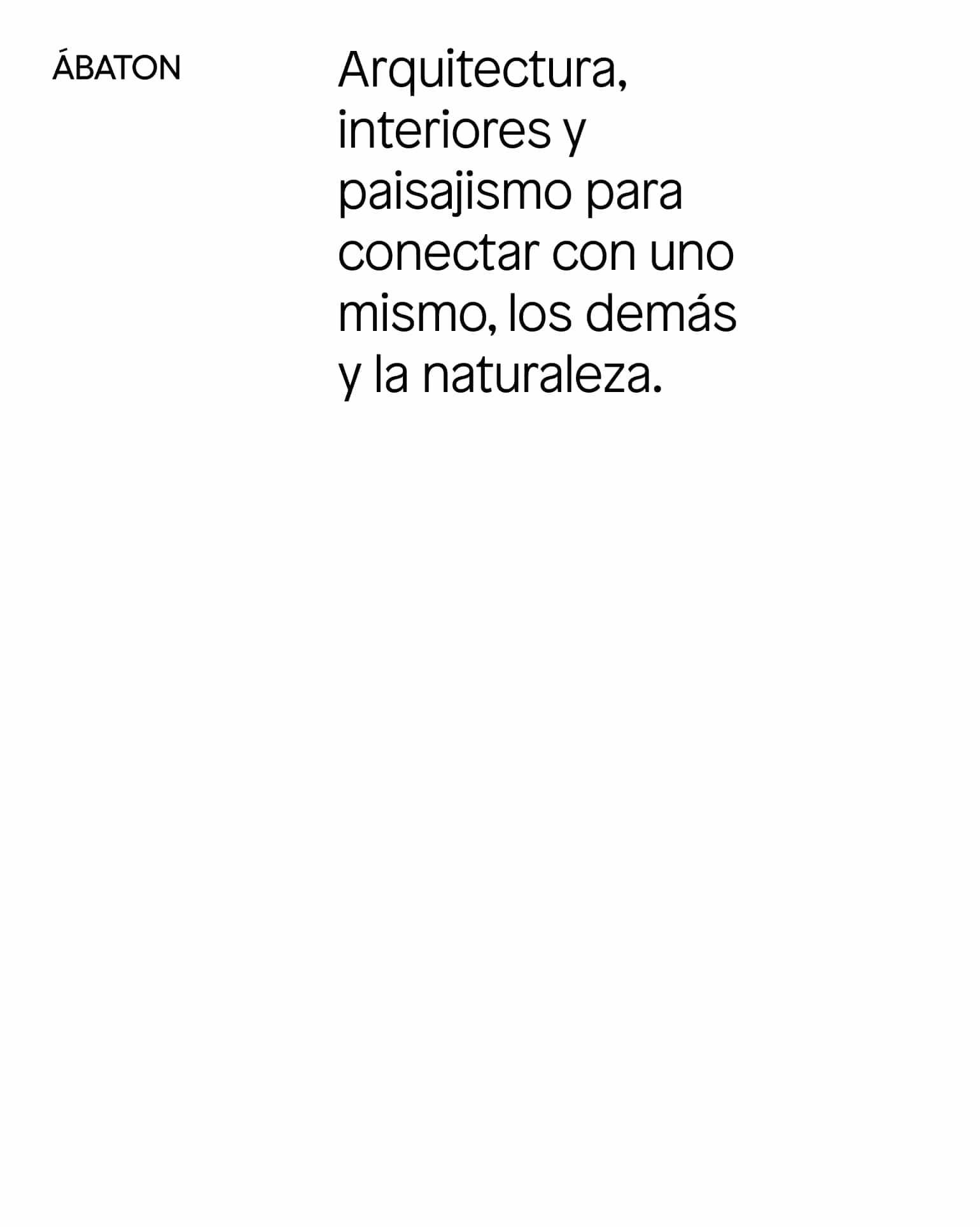
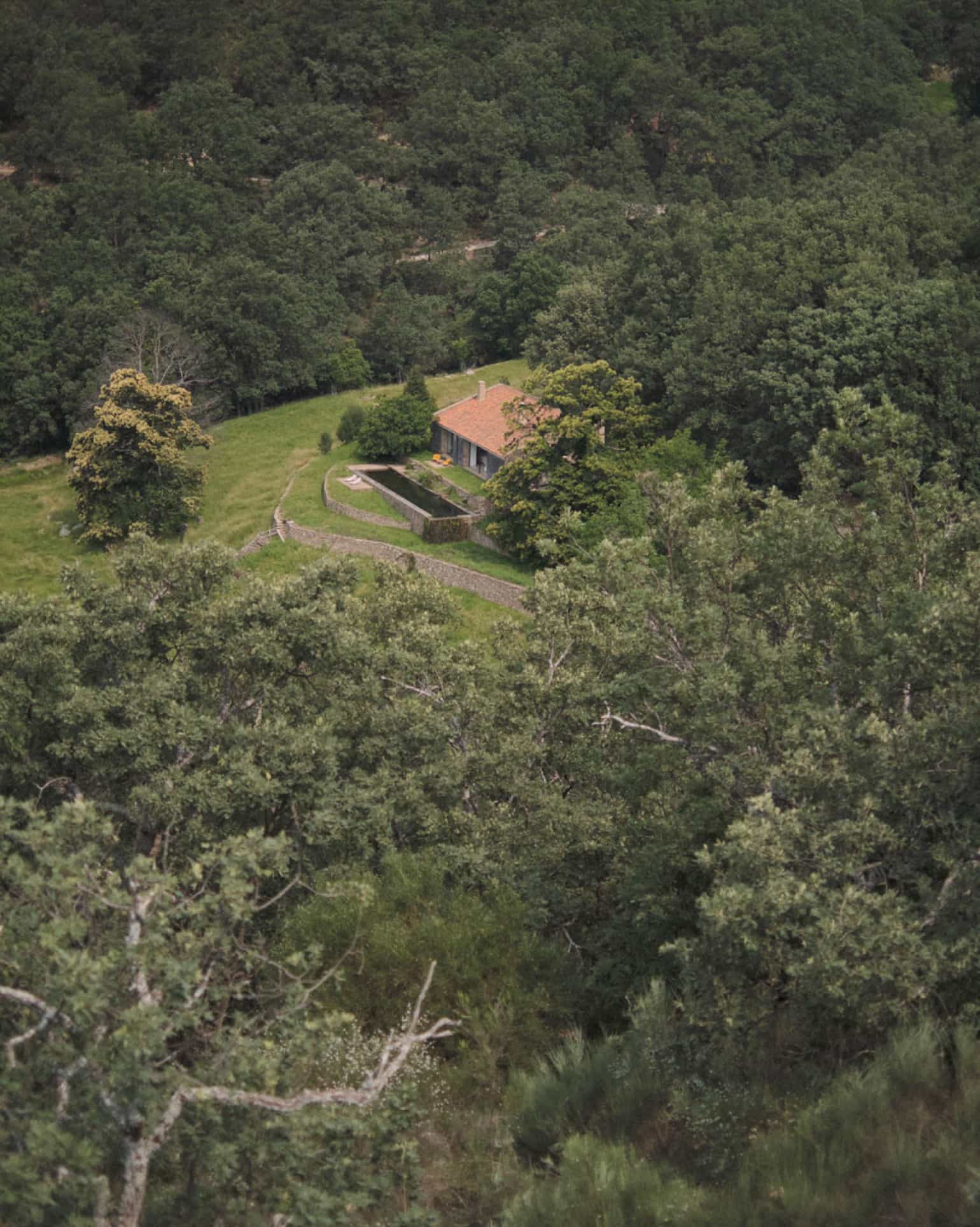
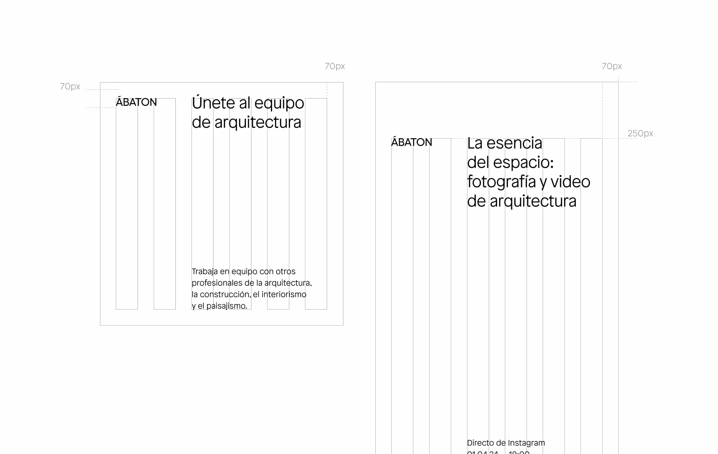
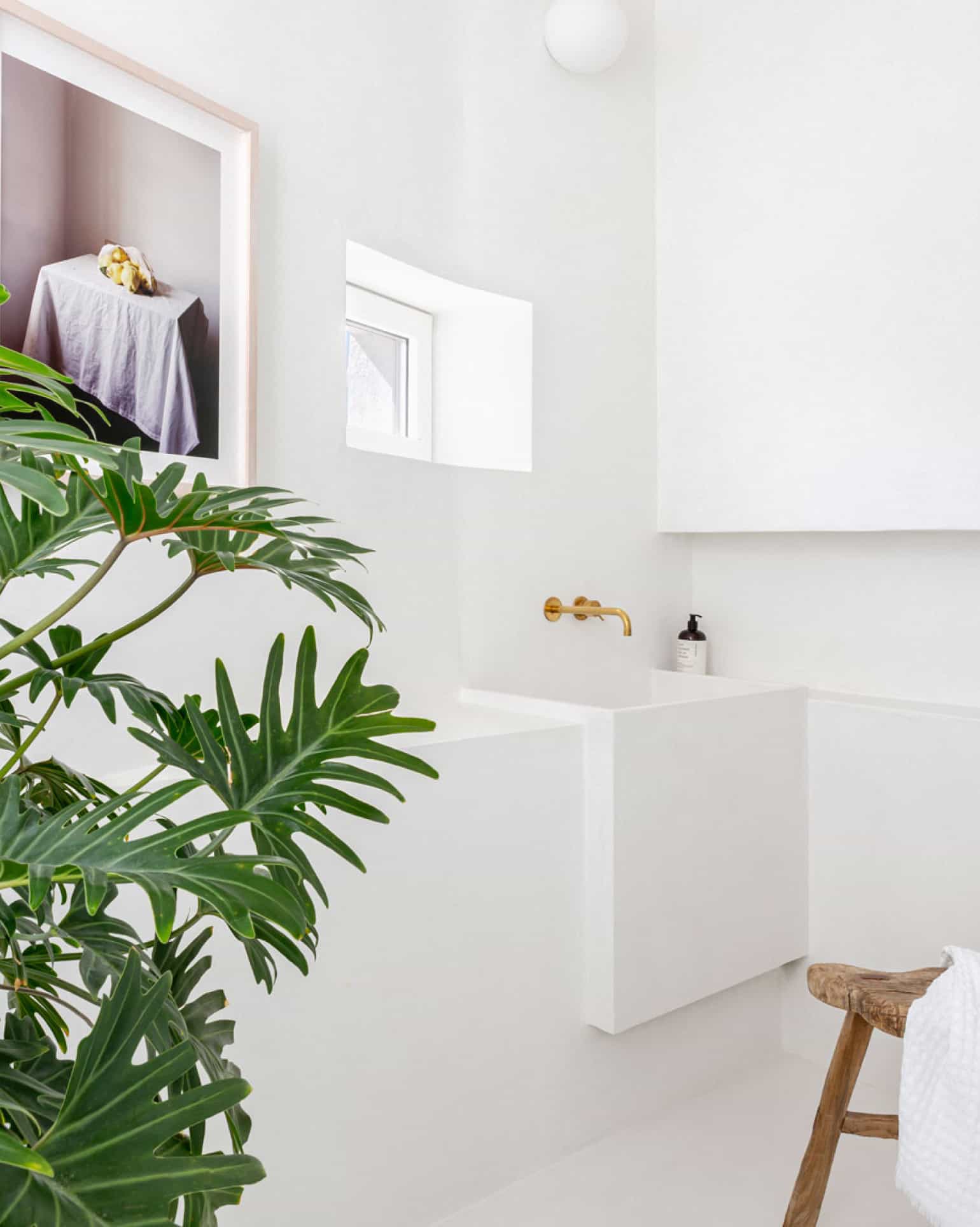
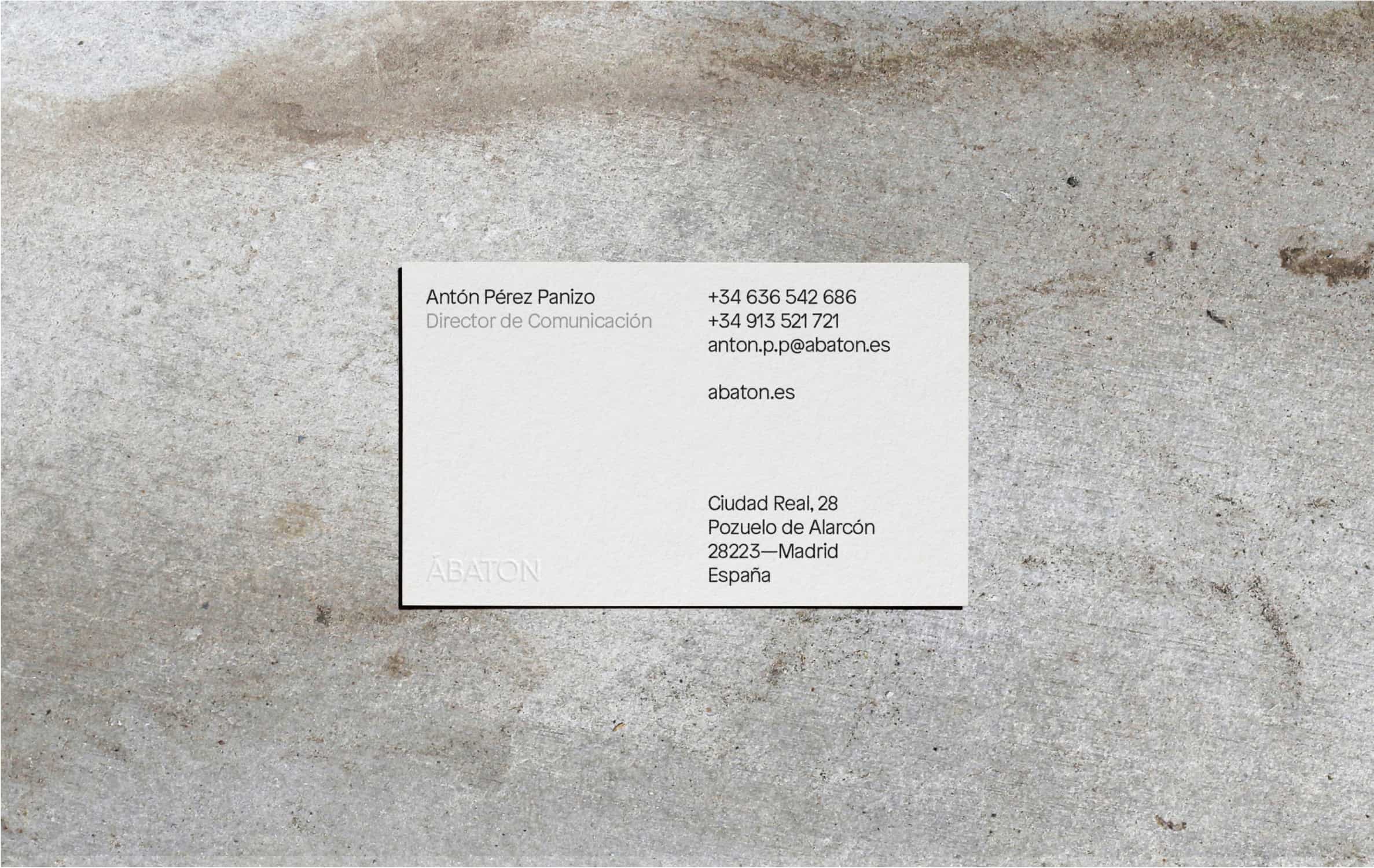
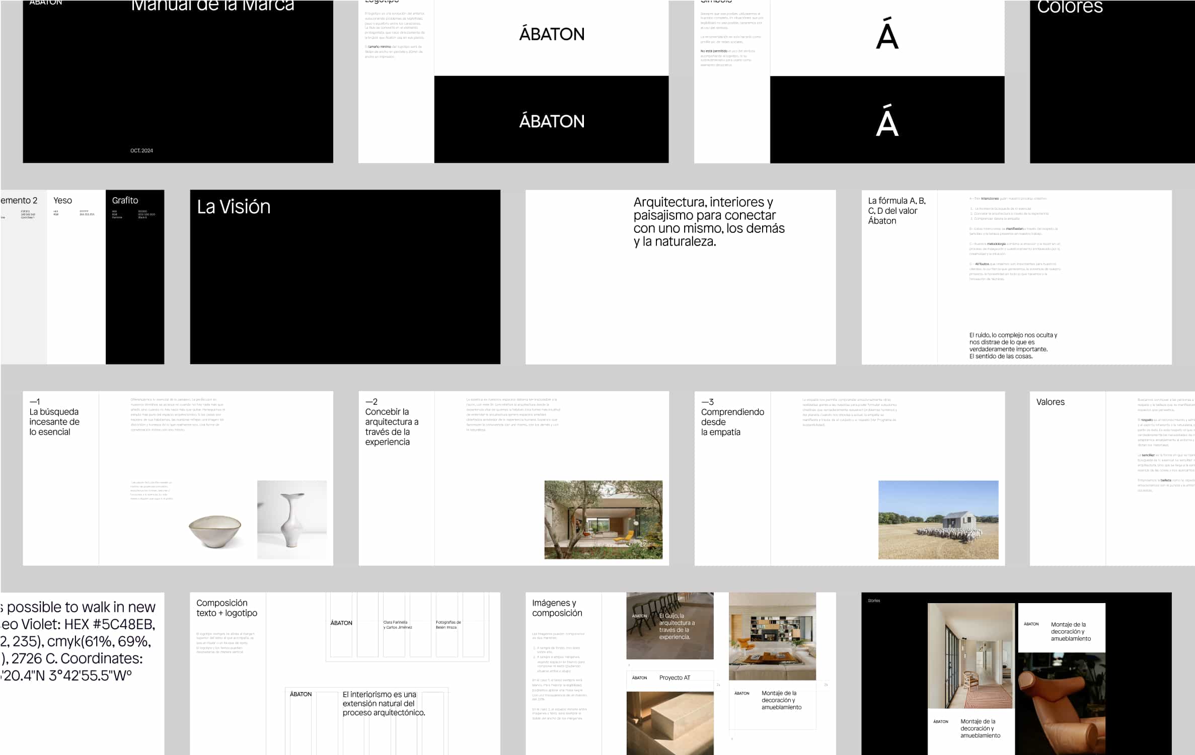
Ábaton is an architecture, interior design, and landscaping studio based in Madrid that believes perfection is achieved not when there is nothing left to add, but when there is nothing left to take away. Inspired by this absence of artifices, the redesign of its brand is built upon a flexible, asymmetrical system, where white space takes on a central role, defining the arrangement of all other elements.
The new logo is an evolution of the previous one—more balanced and readable—where a customized accent markbecomes the key visual element. This detail is directly derived from the compass Ábaton uses in its blueprints to indicate orientation.
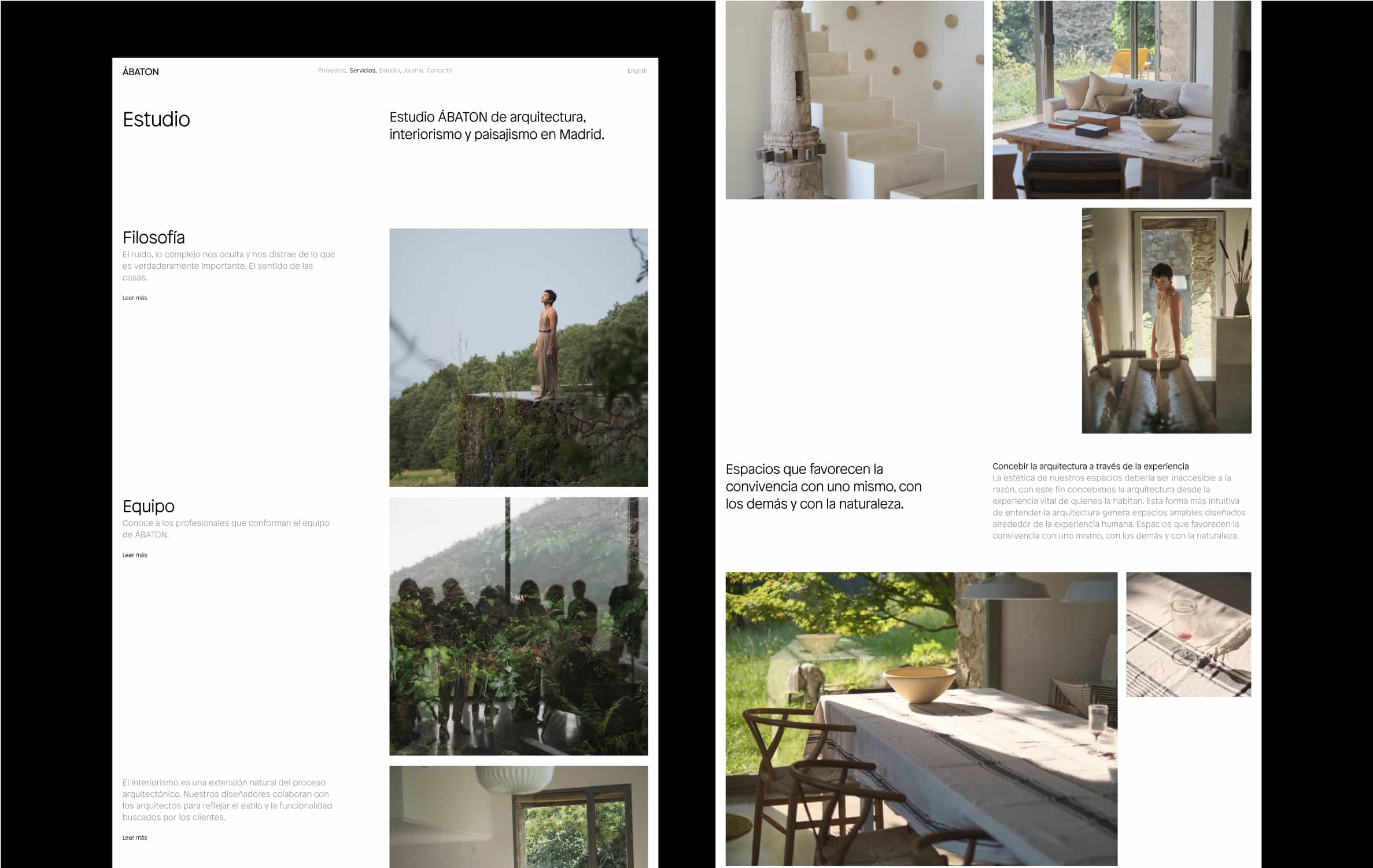
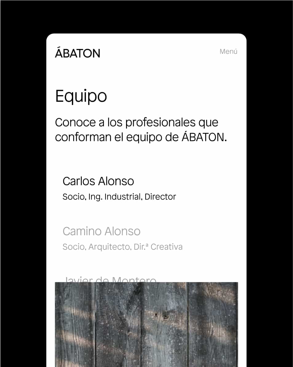
On the website, minimalism reaches its peak, with white space playing as significant a role as content and imagery. The design incorporates a concise, highly functional project-tagging system, reinforcing a more editorial character, especially noticeable on the projects page. This direction gains further weight thanks to strategic content by Juan Ramírez of Brands of this Century and a blog that now takes center stage, seamlessly integrating with the website. Transformed into the Journal, it becomes a space for projects that inspire us and reflections on the future.

