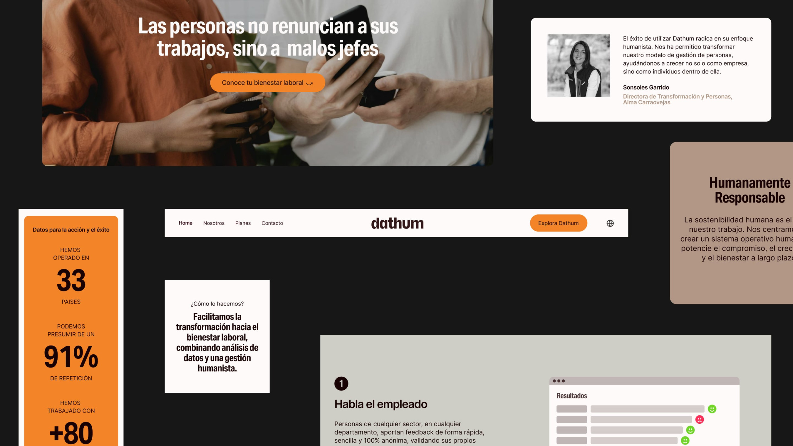
—Dathum
Data through human eyes


Dathum is a technology company with a singular vision: to build a future where data and the human coexist seamlessly.
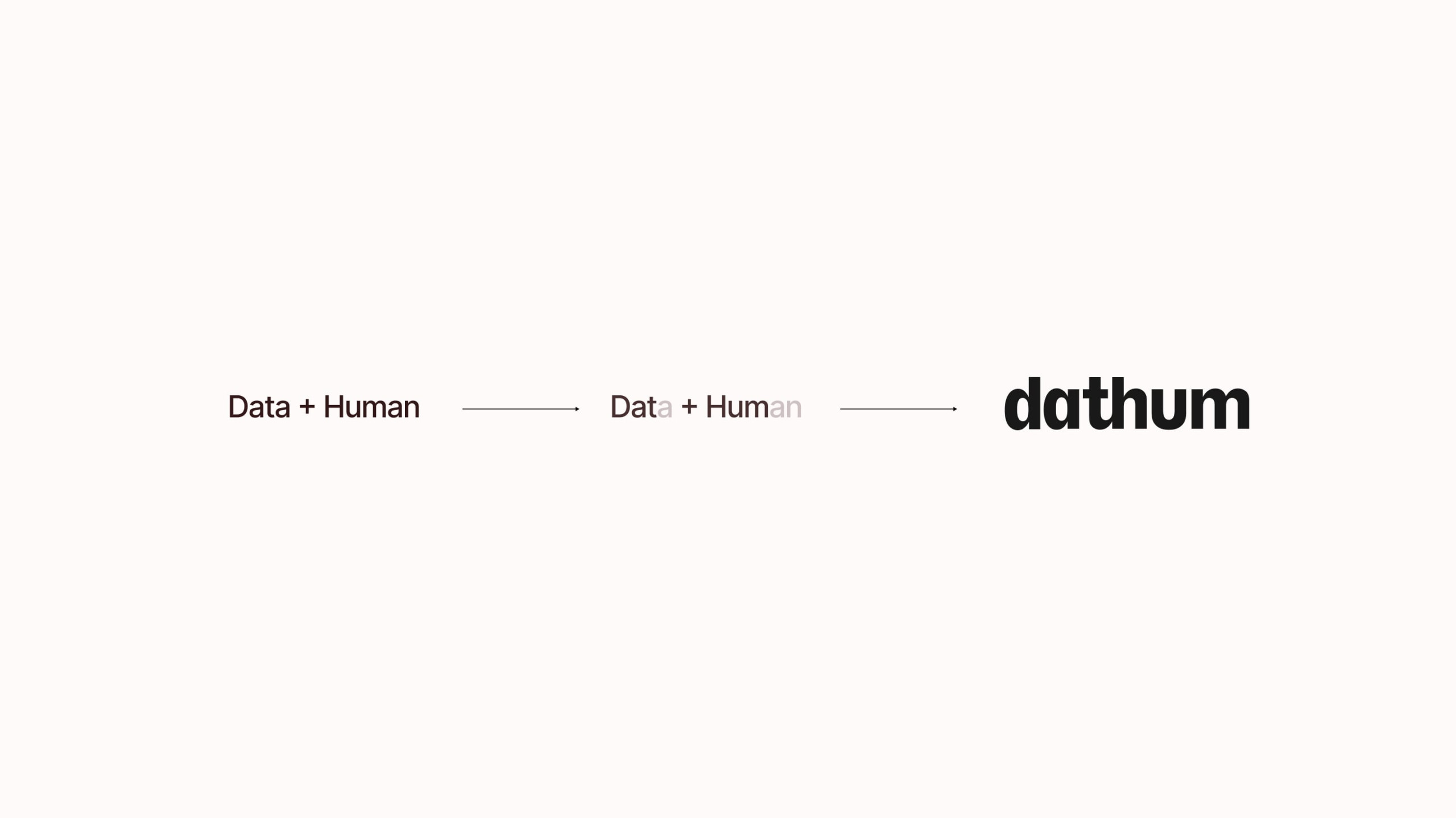
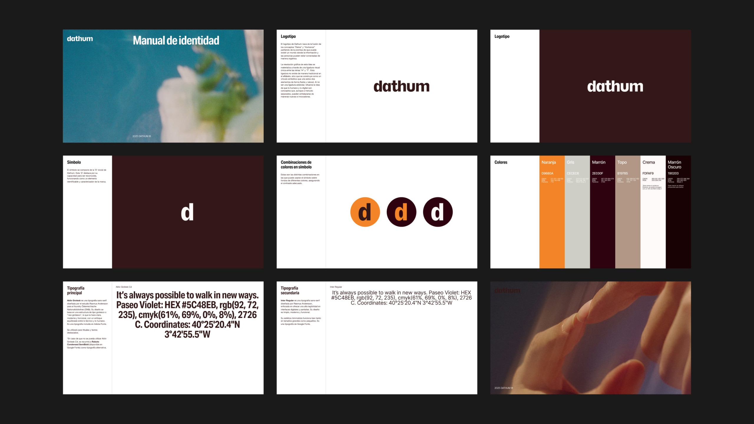
Its name merges data and human — a union made tangible in the logotype through a custom ligature between the letters “h” and “t.” This connection, absent in the traditional alphabet, symbolizes the interdependence between the human and the digital, and underscores the brand’s experimental spirit.
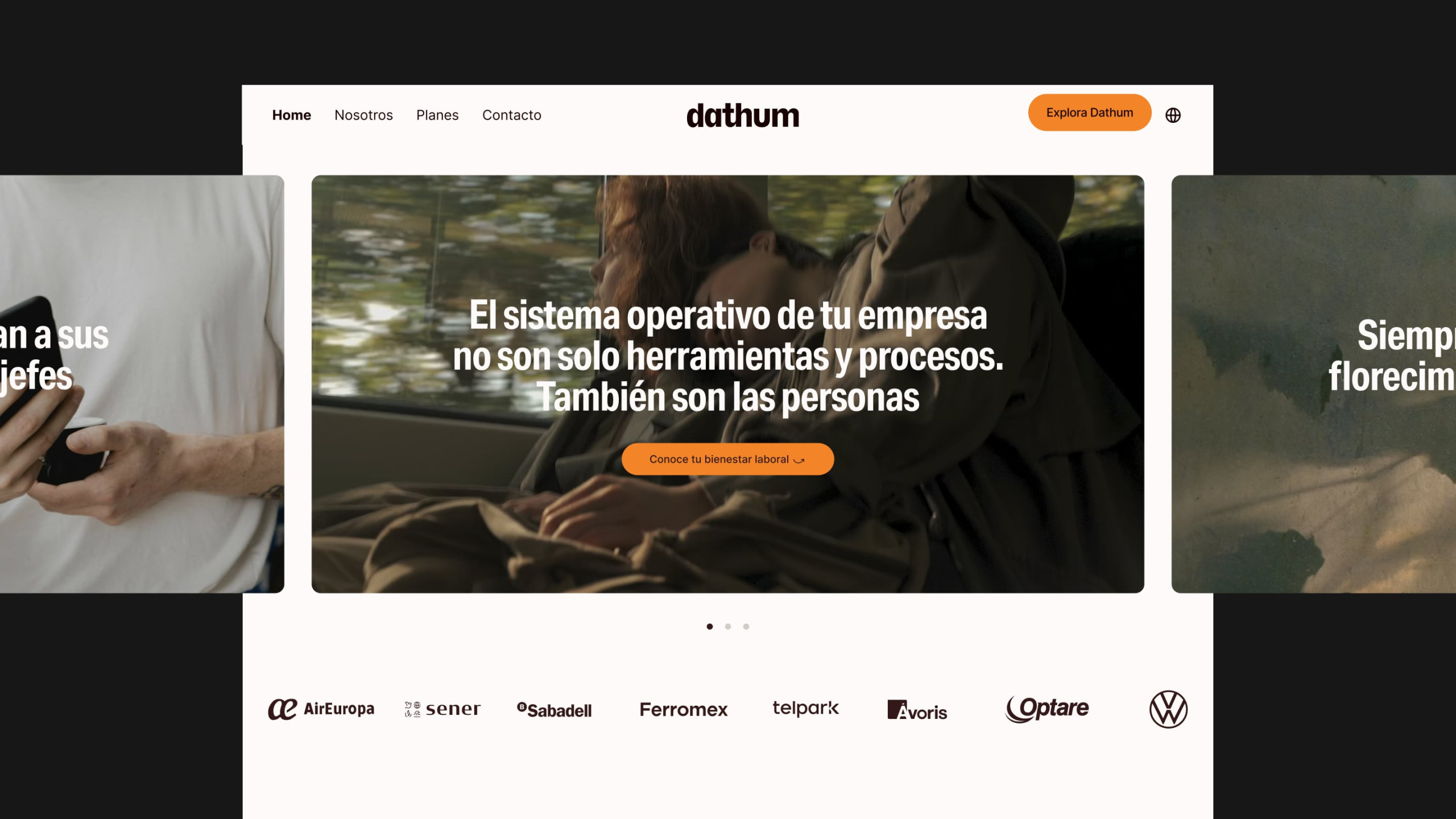
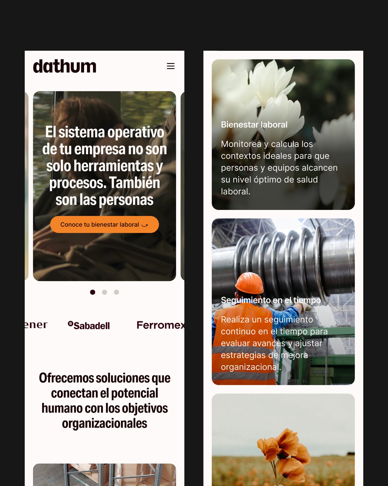
The website distills Dathum’s core values — clarity, experimentation, approachability — into a visual language that balances structure and flexibility. White space is treated as an active element, typography is precisely calibrated, and subtle transitions guide a navigation that feels fluid and intuitive. The result is a digital experience that reflects the brand’s technological edge and human warmth.
Design direction by Alix Martínez Martínez.
Brand strategy by Juan Ramírez (Brands of This Century).

